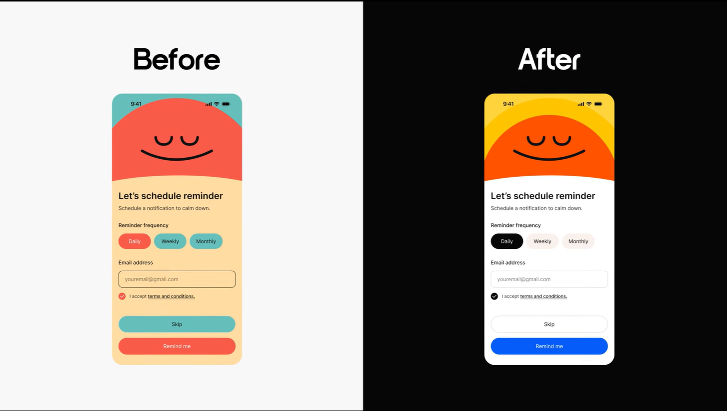
Have you ever found a beautiful color palette on a website, applied it to your design, and ended up with something that looks like a “messy toddler’s fingerpainting”? You are not alone. Most designers struggle because they don’t understand that UI Design is different from Graphic Design.
1. The Functional Goal of UI
In graphic design, colors are often expressive. In UI Design, colors have a hierarchy and a function.
Every element—backgrounds, buttons, icons—works together to help the user achieve a goal (e.g., booking a hotel or ordering a pizza).
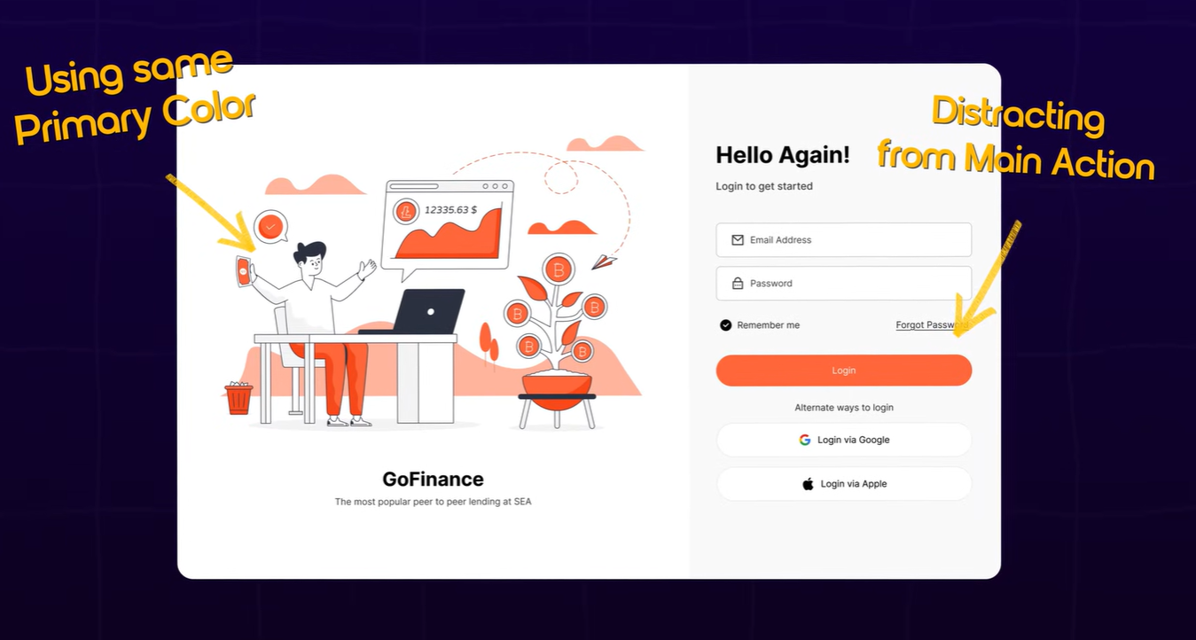
Too many colors distract the user from that goal.
No colors make the design “dull,” making it harder for users to know where to click.
2. The Golden Rule: The 1-Color Balance
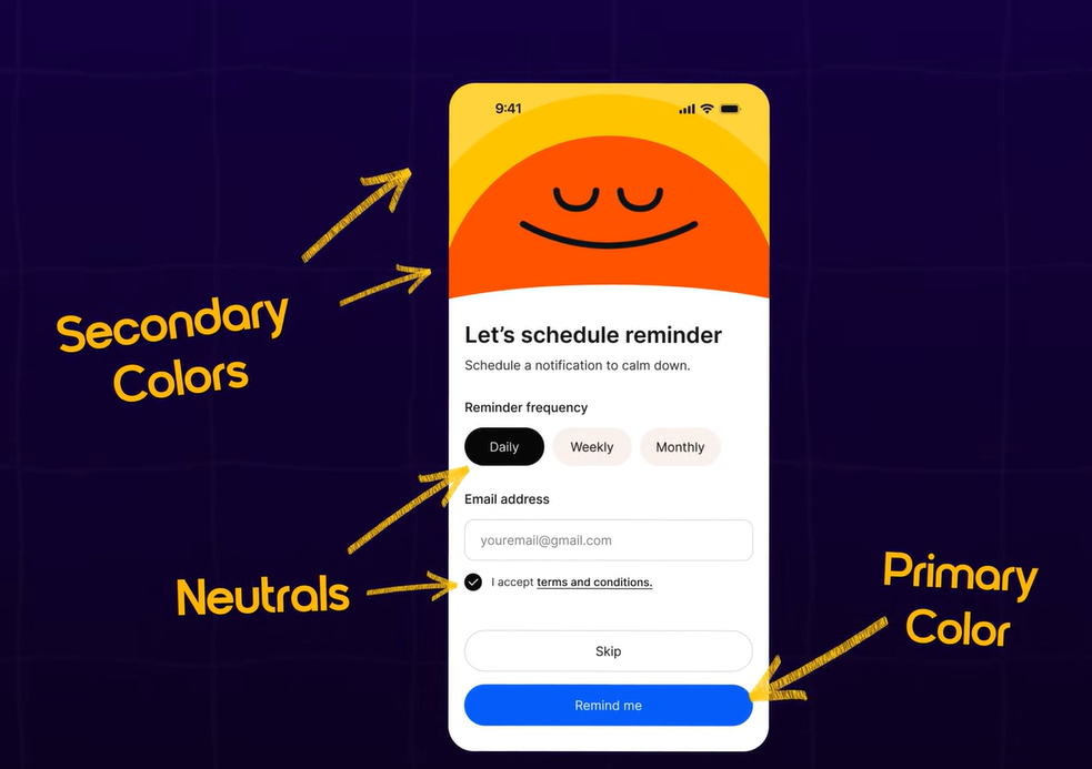
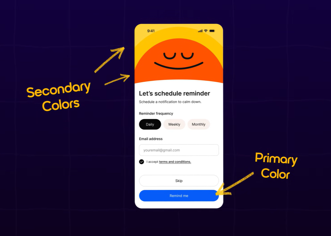
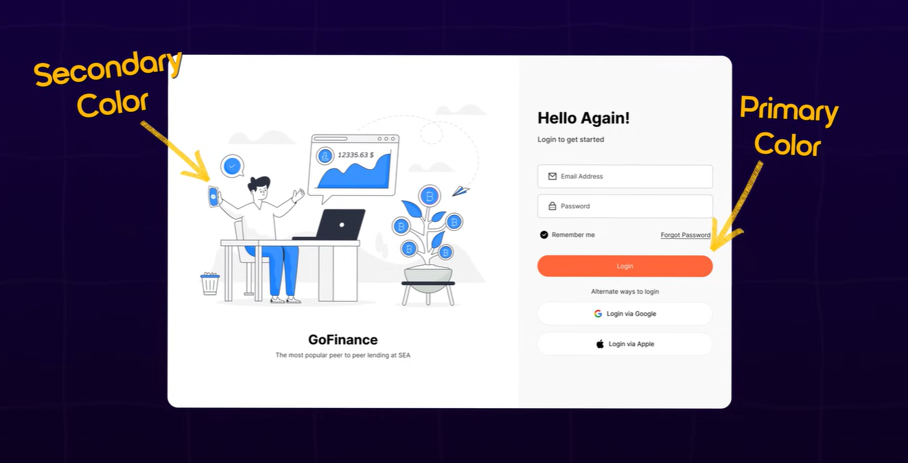
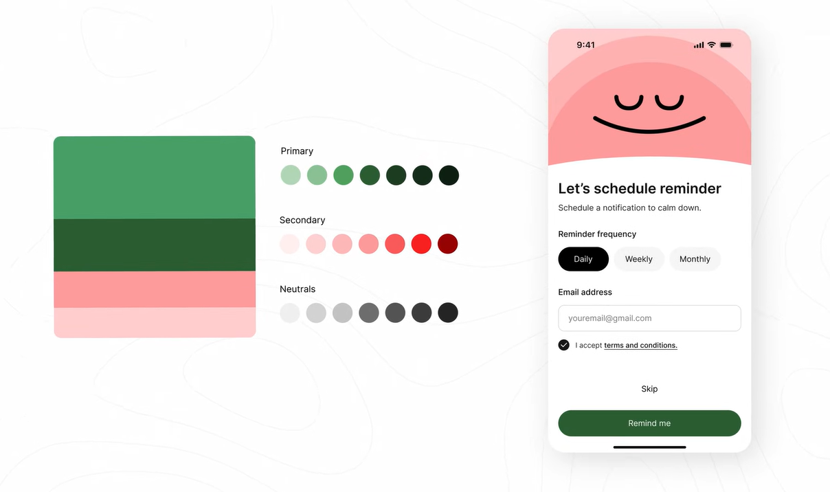
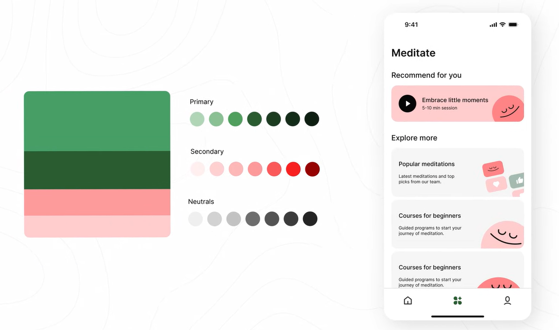
Modern web design relies on a specific balance. You really only need one main color, known as your Primary Color.
Primary Color: Use this only where you want the user to take the main action (Buttons, active states, links).
Neutral Colors: For everything else, use white, black, and a range of grays. This keeps the focus on the primary action.
3. Adding Expression with Supporting Colors
Sometimes a design feels too “boring” with just grays. This is where Supporting Colors (Secondary colors) come in.
The Purpose: Use these to add warmth or personality to illustrations and brand elements without distracting from the main button.
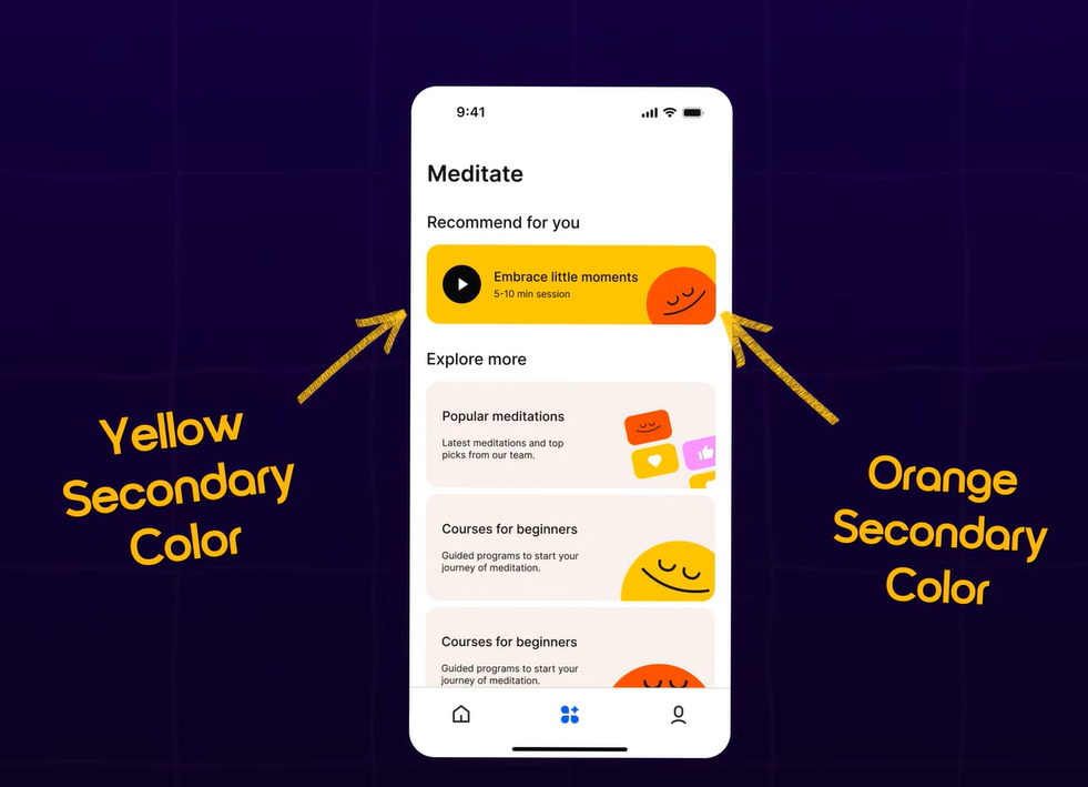
Example: Look at the Headspace app. Blue is their primary action color, but they use Orange and Yellow as supporting colors in their illustrations to add warmth.
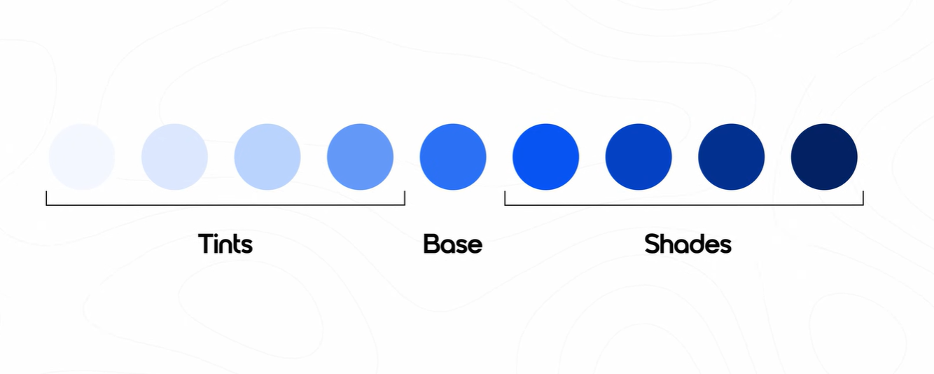
4. Tints and Shades (Defining UI States)
When a user hovers over or presses a button, the color must change. You create these variations using Tints and Shades.
Tint: A lighter version of your base color (adding white).
Shade: A darker version of your base color (adding black).
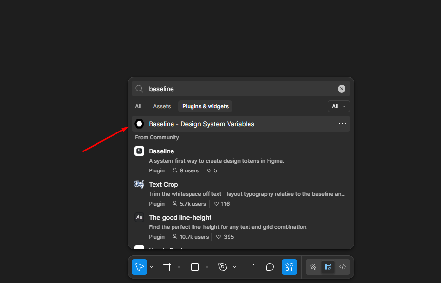
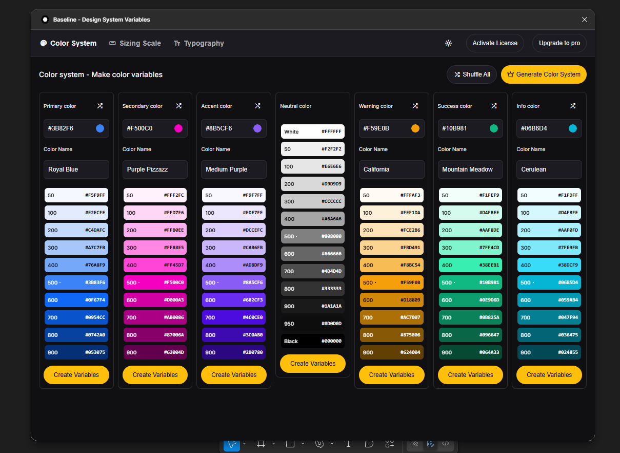
Pro Tip: Use the Figma Baseline Plugin to generate a scale from 100 to 950 automatically. Usually, 500 is your base, 600 is for hover, and 700 is for a pressed state.
5. How to Find the Perfect Supporting Colors
If you have one brand color but need supporting colors that “match,” use these two professional methods:
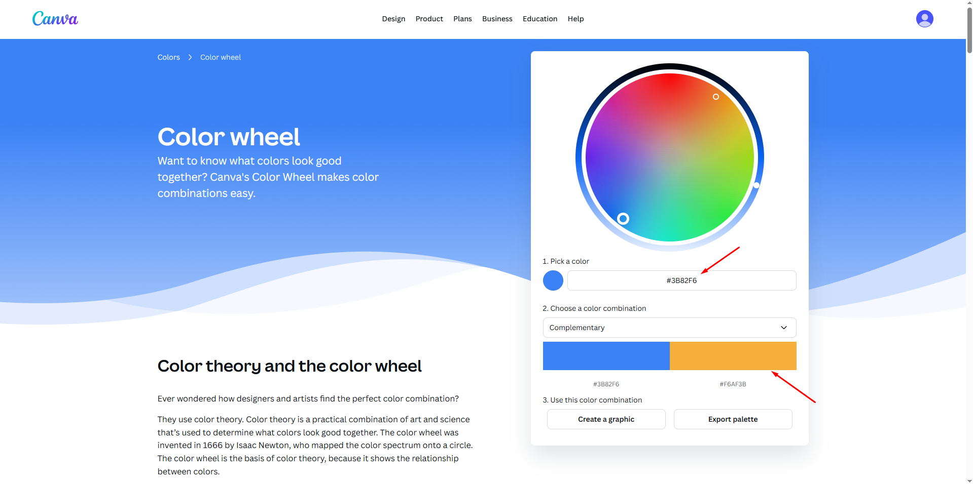
Canva Color Wheel: Paste your primary hex code and select “Complementary” or “Analogous” mode. These modes produce colors that are mathematically guaranteed to look good with your primary color.
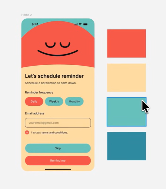
When you find a “fancy” palette online, don’t use all the colors for UI elements. Follow this formula:
Pick the most vibrant/meaningful color as your Primary Color.
Use one or two other colors as Supporting Colors for illustrations only.
Use Neutrals (Black, White, Gray) for 90% of the rest of the UI.
Note for Designers:
“UI Hierarchy > Color Beauty.” A beautiful palette can ruin a UI if it’s used without a goal. Always ask yourself: “Does this color help the user know where to click?” If the answer is no, stick to neutrals.