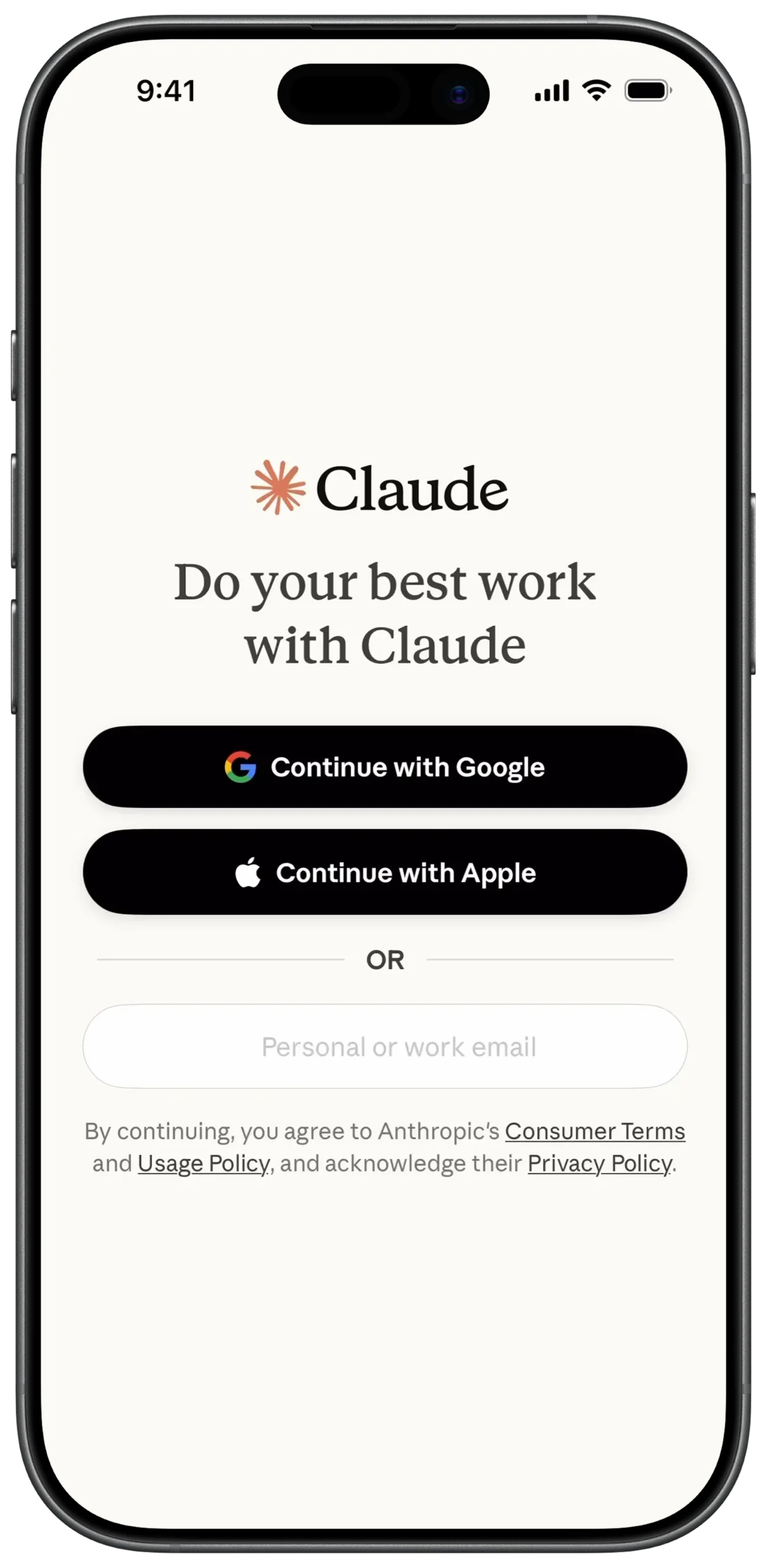
① SCREEN ROOT STRUCTURE
Scaffold
→ SafeArea
→ Padding (Equal margin on all sides)
→ Column
→ (Main vertical layout for all elements)
② BRAND LOGO SECTION
Column
→ SizedBox (height: 80)
→ Center
→ Row
→ MainAxisAlignment: center
→ SvgPicture.asset
→ Claude Star Logo
→ SizedBox (width: 10)
→ Text
→ "Claude"
→ Style: Bold / Serif font
③ MAIN TAGLINE
Column
→ SizedBox (height: 20)
→ Center
→ Text
→ "Do your best work with Claude"
→ Style: Serif font / H1
→ TextAlign: center
④ SOCIAL AUTH BUTTON STRUCTURE (REUSABLE)
Column
→ ElevatedButton
→ BackgroundColor: Black
→ BorderRadius: Rounded
→ Padding
→ Row
→ MainAxisAlignment: center
→ Icon / Image (Provider logo)
→ SizedBox (width: 10)
→ Text
→ Button label
→ Color: White
⑤ SOCIAL AUTH — GOOGLE & APPLE
SizedBox (height: 50)
→ ElevatedButton
→ Image.asset (Google logo)
→ Text: "Continue with Google"
SizedBox (height: 15)
→ ElevatedButton
→ Icon (Apple logo, White)
→ Text: "Continue with Apple"
⑥ OR DIVIDER SECTION
Column
→ SizedBox (height: 30)
→ Row
→ Expanded
→ Divider
→ Padding (Horizontal: 15)
→ Text
→ "OR"
→ Style: Small / Grey
→ Expanded
→ Divider
⑦ EMAIL INPUT FIELD
Column
→ SizedBox (height: 30)
→ TextField
→ InputDecoration
→ HintText: "Personal or work email"
→ ContentPadding (Internal spacing)
→ OutlineInputBorder
→ BorderRadius: Rounded
⑧ TERMS & PRIVACY SECTION
Column
→ SizedBox (height: 30)
→ RichText
→ TextAlign: center
→ TextSpan
→ "By continuing, you agree to Anthropic's "
→ TextSpan
→ "Consumer Terms"
→ Style: Underline / Link
→ TextSpan
→ " and "
→ TextSpan
→ "Usage Policy"
→ Style: Underline / Link
→ TextSpan
→ ", and acknowledge their "
→ TextSpan
→ "Privacy Policy"
→ Style: Underline / Link
① SCREEN ROOT STRUCTURE
Scaffold
→ SafeArea
→ Padding (Equal margin on all sides)
→ Column
→ (Main vertical layout for all elements)
② BRAND LOGO SECTION
Column
→ SizedBox (height: 80)
→ Center
→ Row
→ MainAxisAlignment: center
→ SvgPicture.asset
→ Claude Star Logo
→ SizedBox (width: 10)
→ Text
→ "Claude"
→ Style: Bold / Serif font
③ MAIN TAGLINE
Column
→ SizedBox (height: 20)
→ Center
→ Text
→ "Do your best work with Claude"
→ Style: Serif font / H1
→ TextAlign: center
④ SOCIAL AUTH BUTTON STRUCTURE (REUSABLE)
SizedBox (height: 50)
→ ElevatedButton
→ Image.asset (Google logo)
→ Text: "Continue with Google"
SizedBox (height: 15)
→ ElevatedButton
→ Icon (Apple logo, White)
→ Text: "Continue with Apple"
⑤ SOCIAL AUTH — GOOGLE & APPLE
SizedBox (height: 50)
→ ElevatedButton
→ Image.asset (Google logo)
→ Text: "Continue with Google"
SizedBox (height: 15)
→ ElevatedButton
→ Icon (Apple logo, White)
→ Text: "Continue with Apple"
⑥ OR DIVIDER SECTION
Column
→ SizedBox (height: 30)
→ Row
→ Expanded
→ Divider
→ Padding (Horizontal: 15)
→ Text
→ "OR"
→ Style: Small / Grey
→ Expanded
→ Divider
⑦ EMAIL INPUT FIELD
Column
→ SizedBox (height: 30)
→ TextField
→ InputDecoration
→ HintText: "Personal or work email"
→ ContentPadding (Internal spacing)
→ OutlineInputBorder
→ BorderRadius: Rounded
⑧ TERMS & PRIVACY SECTION
Column
→ SizedBox (height: 30)
→ RichText
→ TextAlign: center
→ TextSpan
→ "By continuing, you agree to Anthropic's "
→ TextSpan
→ "Consumer Terms"
→ Style: Underline / Link
→ TextSpan
→ " and "
→ TextSpan
→ "Usage Policy"
→ Style: Underline / Link
→ TextSpan
→ ", and acknowledge their "
→ TextSpan
→ "Privacy Policy"
→ Style: Underline / Link
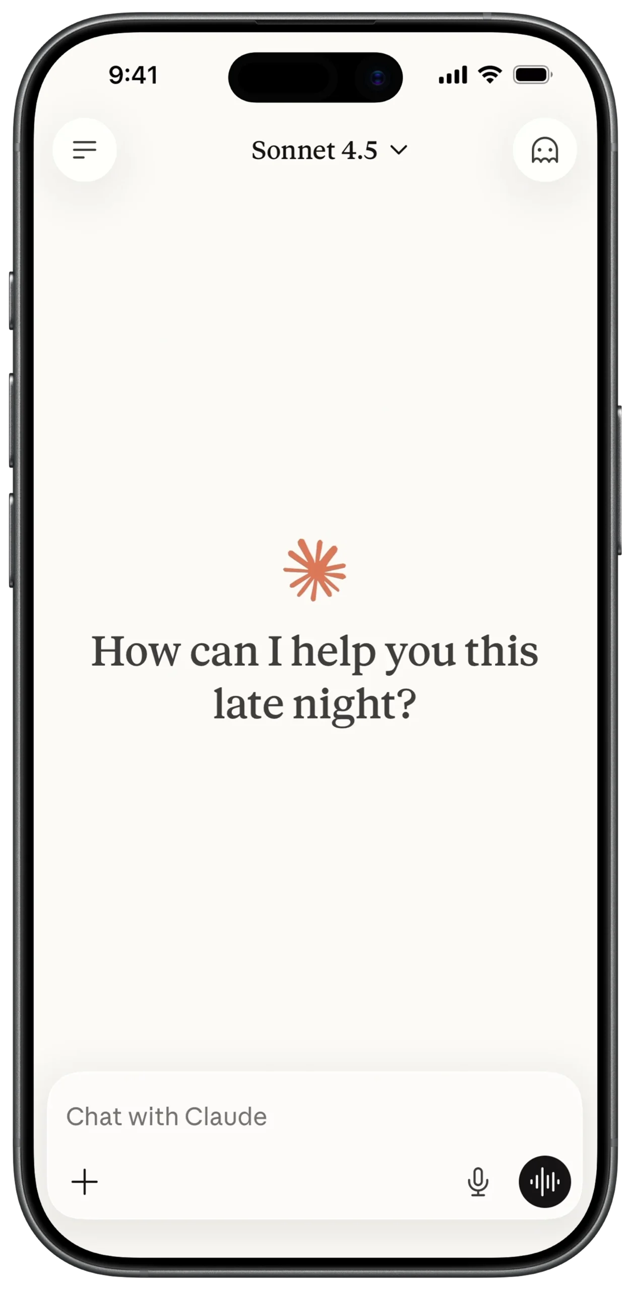
① SCREEN ROOT STRUCTURE
Scaffold
→ resizeToAvoidBottomInset: true
→ SafeArea
→ Column
→ (All sections stacked vertically)
② TOP NAVIGATION BAR
Column
→ Padding (Horizontal margin)
→ Row
→ Container (Circle shape)
→ IconButton (Menu / Hamburger)
→ Spacer
→ Row (Model selector)
→ Text
→ "Sonnet 4.5"
→ Style: Serif font
→ Icon (Keyboard Arrow Down)
→ Spacer
→ Container (Circle shape)
→ IconButton (Profile / Ghost icon)
③ MAIN CANVAS (EMPTY STATE)
Column
→ Expanded
→ Center
→ Column
→ SvgPicture.asset (Claude Star Logo)
→ SizedBox (height: 20)
→ Text
→ "How can I help you this
late night?"
→ Style: Serif / H1
→ TextAlign: center
④ CHAT INPUT AREA (FLOATING STYLE)
Column
→ Padding (Around input container)
→ Container
→ Background: White
→ BorderRadius: 24
→ BoxShadow: Soft shadow
→ Column
→ (Text entry + bottom controls)
⑤ TEXT ENTRY FIELD
Column (Inside Input Container)
→ Padding (Inner margin)
→ TextField
→ InputDecoration
→ HintText: "Chat with Claude"
→ HintStyle: Grey
→ Border: none
⑥ ATTACHMENT & VOICE CONTROLS
Column
→ Padding (Bottom row spacing)
→ Row
→ IconButton (+ Attachment)
→ Spacer
→ IconButton (Microphone)
→ SizedBox (width: 10)
→ Container (Black circle)
→ IconButton
→ Voice waveform
→ Color: White
⑦ SCROLL & KEYBOARD BEHAVIOR
Scaffold
→ resizeToAvoidBottomInset: true
Optional:
→ SingleChildScrollView
→ Ensures input moves upward when keyboard appears
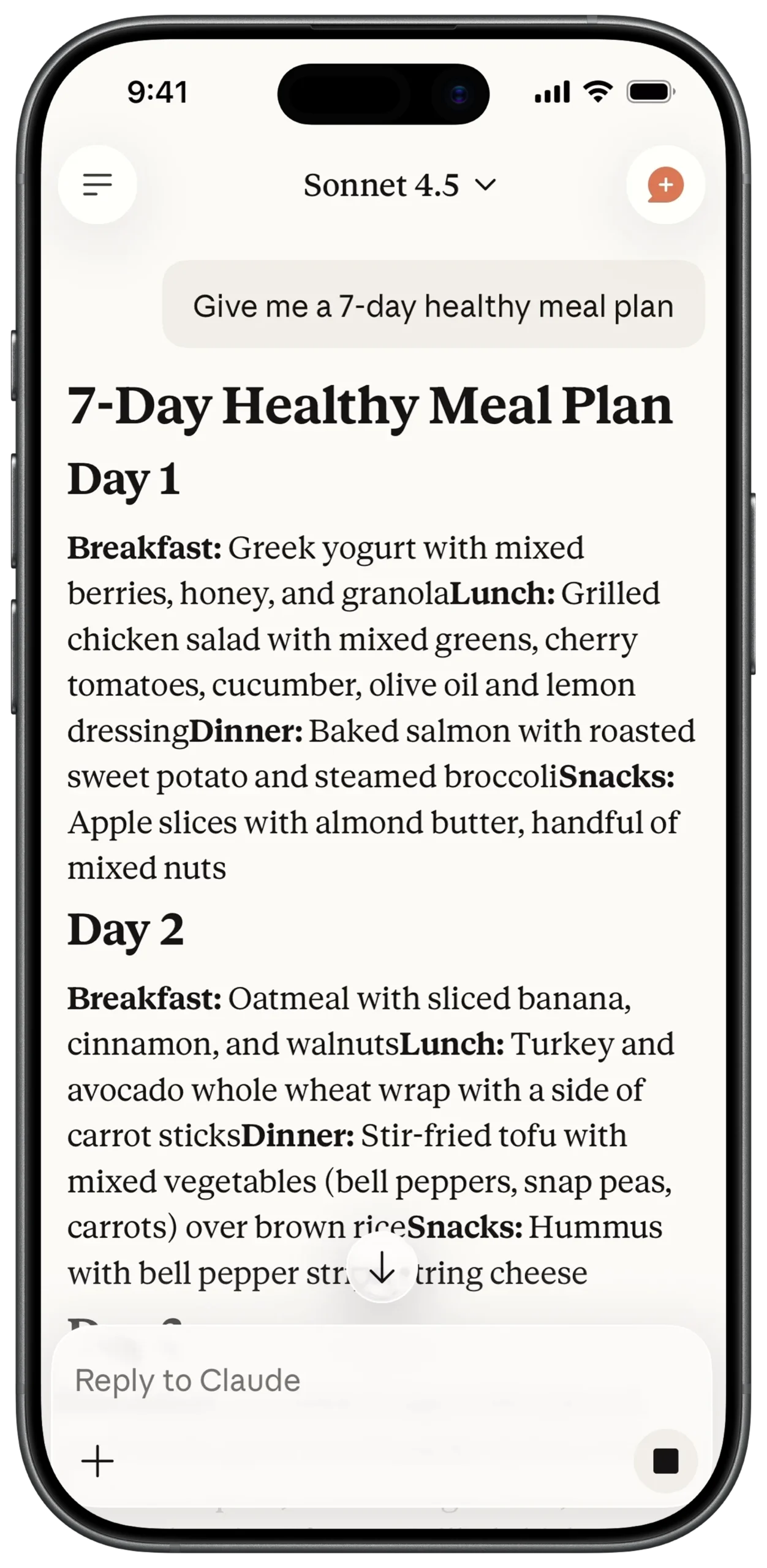
① SCREEN ROOT STRUCTURE
Scaffold
→ SafeArea
→ Stack
→ Column (Main vertical layout)
→ (Overlay elements like scroll indicator layered above)
② TOP NAVIGATION BAR
Column
→ Padding (Horizontal margin)
→ Row
→ Container (Circle shape)
→ IconButton (Menu)
→ Spacer
→ Row (Model selector)
→ Text
→ "Sonnet 4.5"
→ Style: Serif
→ Icon (Keyboard Arrow Down)
→ Spacer
→ Container (Circle shape)
→ Stack
→ IconButton (Profile)
→ Positioned (Small + badge overlay)
③ USER PROMPT BUBBLE
Column
→ Align (Alignment.topRight)
→ Container
→ Background: Light Cream / Grey
→ BorderRadius: 20
→ Padding
→ Text
→ "Give me a 7-day healthy meal plan"
→ Style: Sans-serif
④ CHAT CONTENT AREA
Expanded
→ SingleChildScrollView
→ Padding (Content spacing)
→ Column
→ (Meal plan structured content)
⑤ MEAL PLAN HEADER
Column
→ Text
→ "7-Day Healthy Meal Plan"
→ Style: Serif / H1 / Bold
→ SizedBox (height: 10)
→ Text
→ "Day 1"
→ Style: Serif / H2 / Bold
⑥ MEAL DETAILS (RICH TEXT STRUCTURE)
Column
→ RichText
→ TextSpan
→ "Breakfast: "
→ Style: Bold
→ TextSpan
→ "Greek yogurt with mixed berries..."
→ SizedBox (height: 15)
→ RichText
→ TextSpan
→ "Lunch: "
→ Style: Bold
→ TextSpan
→ Description text
⑦ SCROLL-TO-BOTTOM INDICATOR (OVERLAY)
Stack
→ Positioned
→ Bottom: (Above input area)
→ Alignment: center
→ Container
→ Shape: Circle
→ Background: White
→ BoxShadow: Soft shadow
→ Icon
→ Arrow Downward
⑧ REPLY INPUT AREA (STYLISH CONTAINER)
Column (Screen bottom)
→ Padding
→ Container
→ Background: Off-white / Grey
→ BorderRadius: 24
→ Column
→ TextField
→ Hint: "Reply to Claude"
⑨ ATTACHMENT & SEND CONTROLS
Column
→ Padding (Bottom controls spacing)
→ Row
→ IconButton (+ Attachment)
→ Spacer
→ Container (Black rounded square)
→ IconButton
→ Stop / Send icon
→ Color: White
⑩ SYSTEM INTERFACE & KEYBOARD BEHAVIOR
Scaffold
→ resizeToAvoidBottomInset: true
Optional:
→ MediaQuery (To adjust padding when keyboard appears)
System UI:
→ SafeArea ensures no overlap with notch
→ Input area remains visible when keyboard opens
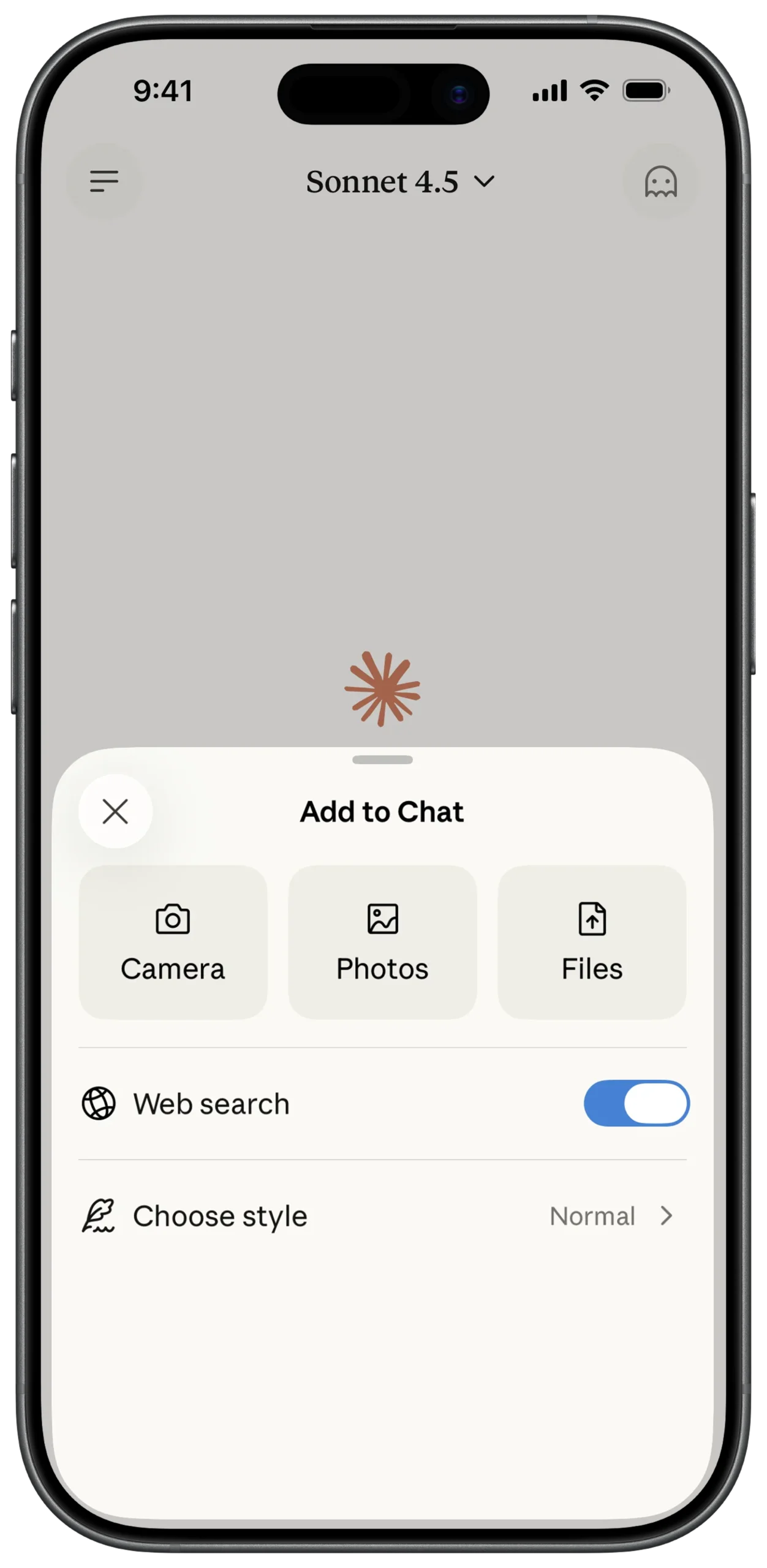
① SCREEN ROOT STRUCTURE
Scaffold
→ Stack
→ (Main Chat Screen)
→ ModalBottomSheet (Layered above chat)
② OVERLAY CANVAS (BOTTOM SHEET CONTAINER)
ModalBottomSheet
→ Container
→ Background: Off-white
→ BorderRadius:
→ TopLeft: Rounded
→ TopRight: Rounded
→ Padding (Internal spacing)
→ Column
→ MainAxisSize: min
→ CrossAxisAlignment: stretch
③ DISMISS & TITLE HEADER
Column
→ Row
→ Container (Circle, Light Grey)
→ IconButton (Close "X")
→ Expanded
→ Center
→ Text
→ "Add to Chat"
→ Style: Bold / Sans-serif
④ MEDIA ACTION GRID
Column
→ SizedBox (height: 20)
→ Row
→ MainAxisAlignment: spaceEvenly
→ MediaButtonWidget (Camera)
→ MediaButtonWidget (Photos)
→ MediaButtonWidget (Files)
⑤ MEDIA BUTTON COMPONENT (REUSABLE)
Column
→ Container
→ Background: Cream
→ BorderRadius: 16
→ Fixed width & height
→ Center
→ Icon (Dynamic: Camera / Photo / File)
→ SizedBox (height: 8)
→ Text
→ Label (e.g., "Camera")
→ Style: Small
⑥ SECTION DIVIDER
Column
→ SizedBox (height: 20)
→ Divider
→ Thickness: Thin
→ Color: Very light grey
⑦ WEB SEARCH TOGGLE
Column
→ Padding (Vertical: 15)
→ Row
→ Icon (Globe)
→ SizedBox (width: 15)
→ Text ("Web search")
→ Spacer
→ Switch
→ Value: true (Active / Blue)
⑧ STYLE CHOOSE OPTION
Column
→ Divider
→ Padding (Vertical: 15)
→ Row
→ Icon (Quill / Style icon)
→ SizedBox (width: 15)
→ Text ("Choose style")
→ Spacer
→ Row
→ Text ("Normal", Grey)
→ Icon (Chevron Right, Grey)
⑨ BACKGROUND DIMMING EFFECT
ModalBottomSheet
→ barrierColor: Colors.black54
⑩ GESTURE & DRAG BEHAVIOR
ModalBottomSheet
→ isScrollControlled: true
→ enableDrag: true
Optional:
→ showDragHandle: true (Top handle indicator)
⑪ SYSTEM INTERFACE & SAFE DISPLAY
SafeArea (Inside BottomSheet if needed)
→ Ensures content does not overlap system UI
Scaffold
→ resizeToAvoidBottomInset: true (If keyboard interaction added later)
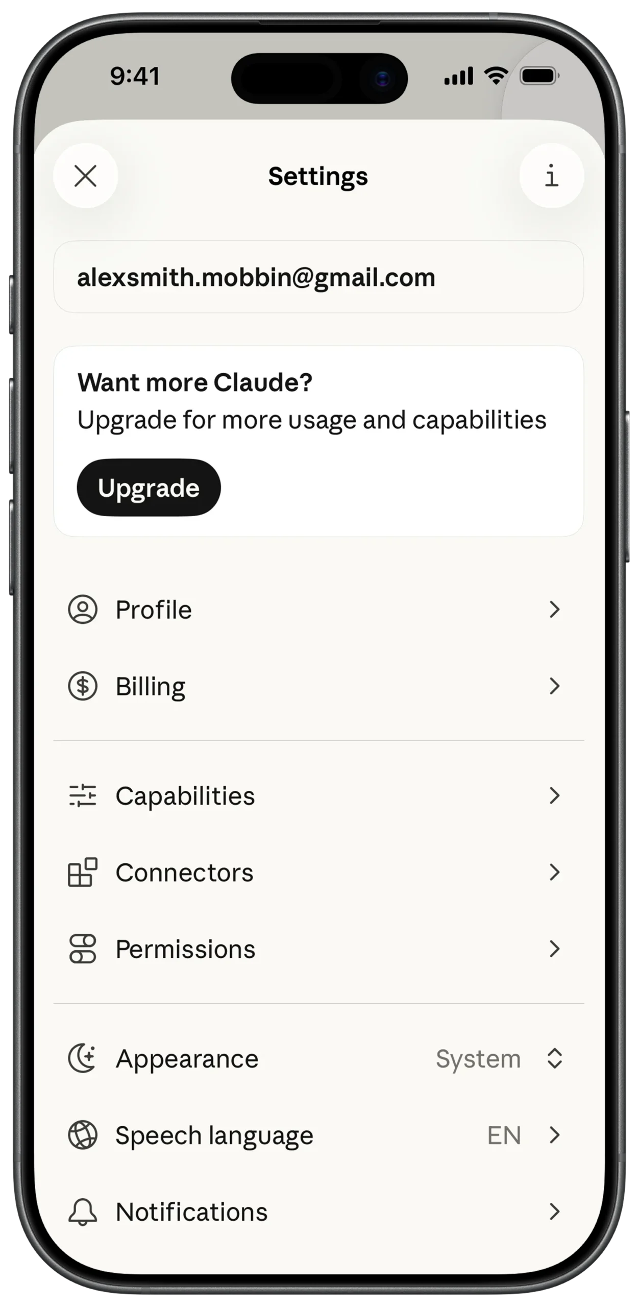
① SCREEN ROOT STRUCTURE
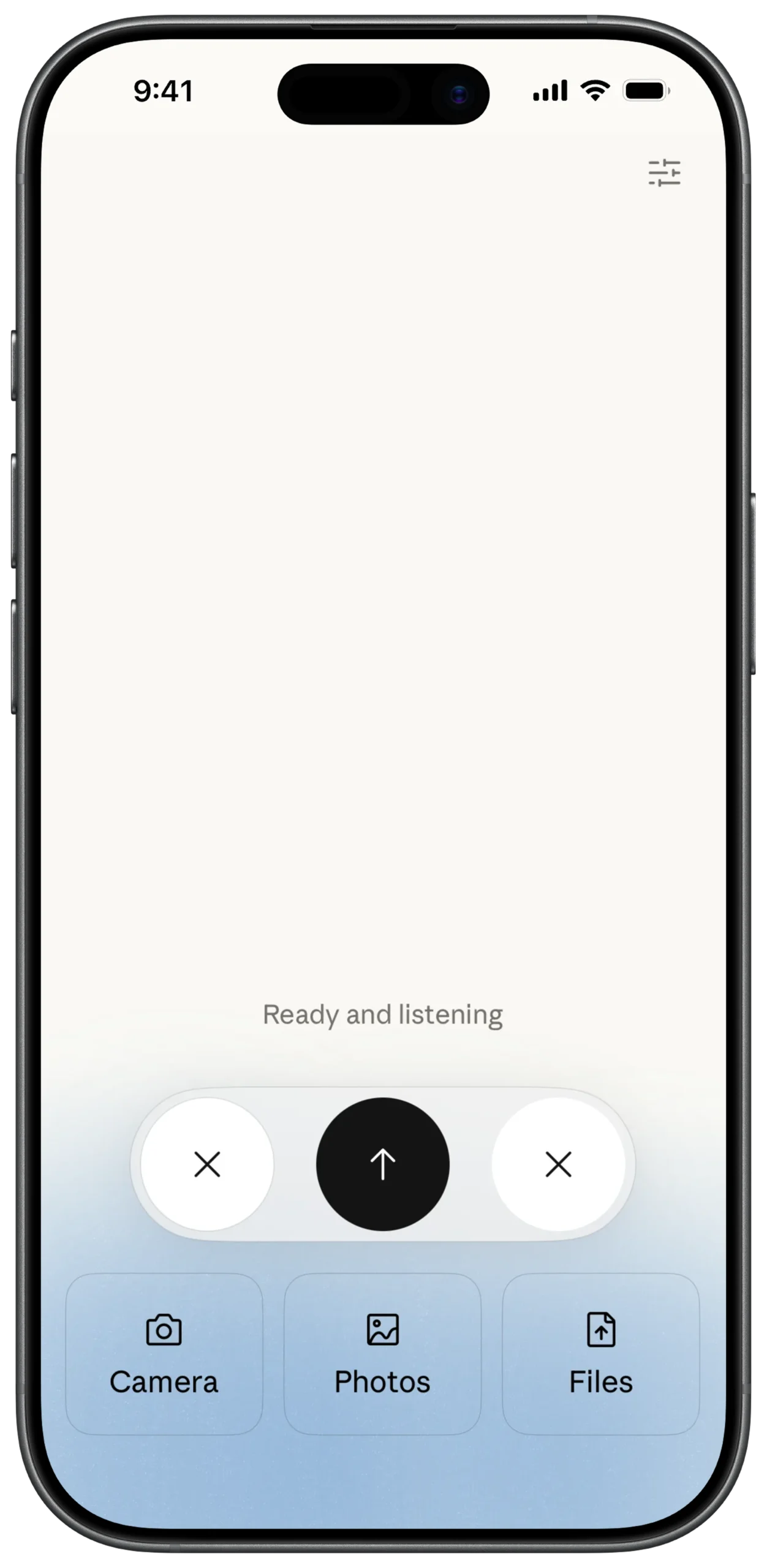
Scaffold
→ SafeArea
→ Stack
② BACKGROUND GRADIENT LAYER
Stack
→ Container (Full screen)
→ BoxDecoration
→ LinearGradient
→ Begin: Alignment.topCenter
→ End: Alignment.bottomCenter
→ Colors:
→ White (Top)
→ Light Blue / Off-white (Bottom)
③ TOP SETTINGS ACTION
Stack
→ Positioned
→ Top: 20
→ Right: 20
→ IconButton
→ Icon: Sliders / Settings
④ STATUS INDICATOR (CENTER TEXT)
Stack
→ Center
→ Column
→ MainAxisSize: min
→ CrossAxisAlignment: center
→ Text
→ "Ready and listening"
→ Style: Soft Grey
→ Font: Sans-serif
⑤ FLOATING CONTROL BAR (MAIN PANEL)
Stack
→ Positioned
→ Bottom: 150
→ Center
→ Container
→ Background: Light Grey / White
→ BorderRadius: 40
→ BoxShadow
→ Padding
→ Row
→ MainAxisAlignment: center
⑥ LEFT DISMISS ACTION
Row (Inside Floating Bar)
→ Container
→ Shape: Circle
→ Background: White
→ IconButton
→ Icon: Close (X)
⑦ MAIN VOICE ACTION (CENTER BUTTON)
Row (Inside Floating Bar)
→ SizedBox (width: 20)
→ Container
→ Shape: Circle
→ Background: Black
→ Size: Large
→ IconButton
→ Icon: Upward Arrow
→ Color: White
⑧ RIGHT ALTERNATIVE DISMISS
Row (Inside Floating Bar)
→ SizedBox (width: 20)
→ Container
→ Shape: Circle
→ Background: White
→ IconButton
→ Icon: Close (X)
⑨ MEDIA SHORTCUTS (BOTTOM ROW)
Stack
→ Positioned
→ Bottom: 50
→ Row
→ MainAxisAlignment: spaceEvenly
→ QuickMediaButton (Camera)
→ QuickMediaButton (Photos)
→ QuickMediaButton (Files)
⑩ QUICK MEDIA BUTTON COMPONENT (REUSABLE)
Column
→ Container
→ Background: Light Blue / Grey Tint
→ BorderRadius: 20
→ Padding
→ Icon (Dynamic: Camera / Photos / Files)
→ SizedBox (height: 5)
→ Text
→ Label
→ Style: Small / Bold
① SCREEN ROOT STRUCTURE
Scaffold
→ SafeArea
→ Row
② SIDEBAR MAIN CANVAS
Row
→ Expanded (flex: 8)
→ Container
→ Background: Off-white / Cream
→ Padding (All sides)
→ Column
→ CrossAxisAlignment: start
③ BRAND TITLE
Column
→ SizedBox (height: 20)
→ Text
→ "Claude"
→ Style: Serif
→ FontWeight: Bold
→ FontSize: Large
④ MAIN NAVIGATION ITEMS
Column
→ SizedBox (height: 30)
→ InkWell
→ Row
→ Icon (Chats)
→ SizedBox (width: 15)
→ Text ("Chats")
→ SizedBox (height: 20)
→ InkWell
→ Row
→ Icon (Artifacts / Magic)
→ SizedBox (width: 15)
→ Text ("Artifacts")
⑤ RECENTS SECTION HEADER
Column
→ SizedBox (height: 40)
→ Text
→ "Recents"
→ Style: Small
→ Color: Grey
⑥ RECENT CHAT LIST
Column
→ SizedBox (height: 15)
→ ListView
→ shrinkWrap: true
→ physics: NeverScrollableScrollPhysics()
→ Padding (Vertical spacing)
→ Text
→ "Weekly dinner planning"
→ maxLines: 1
→ overflow: ellipsis
→ Text ("Motivation letter template impr...")
→ Text ("Seven-day healthy meal plan")
⑦ USER PROFILE SECTION (BOTTOM)
Column
→ Spacer()
→ Row
→ Container
→ Shape: Circle
→ Background: Light Grey
→ Center
→ Text ("AS", Bold/Small)
→ SizedBox (width: 10)
→ Text ("Alex Smith")
⑧ NEW CHAT FLOATING ACTION BUTTON
Stack (Wrap Sidebar Column)
→ Positioned
→ Bottom: 20
→ Right: 20
→ FloatingActionButton
→ Background: Coral / Orange
→ Icon: Message + Plus
→ Color: White
⑨ RIGHT SIDE OVERLAY AREA
Row
→ Expanded (flex: 2)
→ GestureDetector
→ onTap: CloseSidebar()
→ Container
→ Background: White.withOpacity(0.4)
⑩ BLUR / DIM EFFECT (OPTIONAL ENHANCEMENT)
Container
→ BackdropFilter
→ ImageFilter.blur(sigmaX: 5, sigmaY: 5)
→ Container
→ Color: White.withOpacity(0.2)
① SCREEN ROOT STRUCTURE
Scaffold
→ SafeArea
→ Row
① SCREEN ROOT STRUCTURE
Scaffold
→ SafeArea
→ Row
② SIDEBAR MAIN CANVAS
Row
→ Expanded (flex: 8)
→ Container
→ Background: Off-white / Cream
→ Padding (All sides)
→ Column
→ CrossAxisAlignment: start
③ BRAND TITLE
Column
→ SizedBox (height: 20)
→ Text
→ "Claude"
→ Style: Serif
→ FontWeight: Bold
→ FontSize: Large
④ MAIN NAVIGATION ITEMS
Column
→ SizedBox (height: 30)
→ InkWell
→ Row
→ Icon (Chats)
→ SizedBox (width: 15)
→ Text ("Chats")
→ SizedBox (height: 20)
→ InkWell
→ Row
→ Icon (Artifacts / Magic)
→ SizedBox (width: 15)
→ Text ("Artifacts")
⑤ RECENTS SECTION HEADER
Column
→ SizedBox (height: 40)
→ Text
→ "Recents"
→ Style: Small
→ Color: Grey
⑥ RECENT CHAT LIST
Column
→ SizedBox (height: 15)
→ ListView
→ shrinkWrap: true
→ physics: NeverScrollableScrollPhysics()
→ Padding (Vertical spacing)
→ Text
→ "Weekly dinner planning"
→ maxLines: 1
→ overflow: ellipsis
→ Text ("Motivation letter template impr...")
→ Text ("Seven-day healthy meal plan")
⑦ USER PROFILE SECTION (BOTTOM)
Column
→ Spacer()
→ Row
→ Container
→ Shape: Circle
→ Background: Light Grey
→ Center
→ Text ("AS", Bold/Small)
→ SizedBox (width: 10)
→ Text ("Alex Smith")
⑧ NEW CHAT FLOATING ACTION BUTTON
Stack (Wrap Sidebar Column)
→ Positioned
→ Bottom: 20
→ Right: 20
→ FloatingActionButton
→ Background: Coral / Orange
→ Icon: Message + Plus
→ Color: White
⑨ RIGHT SIDE OVERLAY AREA
Row
→ Expanded (flex: 2)
→ GestureDetector
→ onTap: CloseSidebar()
→ Container
→ Background: White.withOpacity(0.4)
⑩ BLUR / DIM EFFECT (OPTIONAL ENHANCEMENT)
Container
→ BackdropFilter
→ ImageFilter.blur(sigmaX: 5, sigmaY: 5)
→ Container
→ Color: White.withOpacity(0.2)