Job Ready Word-press Masterclass, Master International Agency Standards Today
How to Prepare as a Professional WordPress Developer
(Before Applying for a Job)
Many people learn WordPress and Elementor, but agencies and international companies do not hire based on:
❌ “Can you build a website?”
They hire based on: ✅ “How do you build it?”

There is a big difference between someone who drags and drops elements and someone who builds using a structured system. Professional development is about:
Structure
Consistency
Responsiveness
Scalability
Clean execution
If you want to work with serious clients, you must train yourself differently.
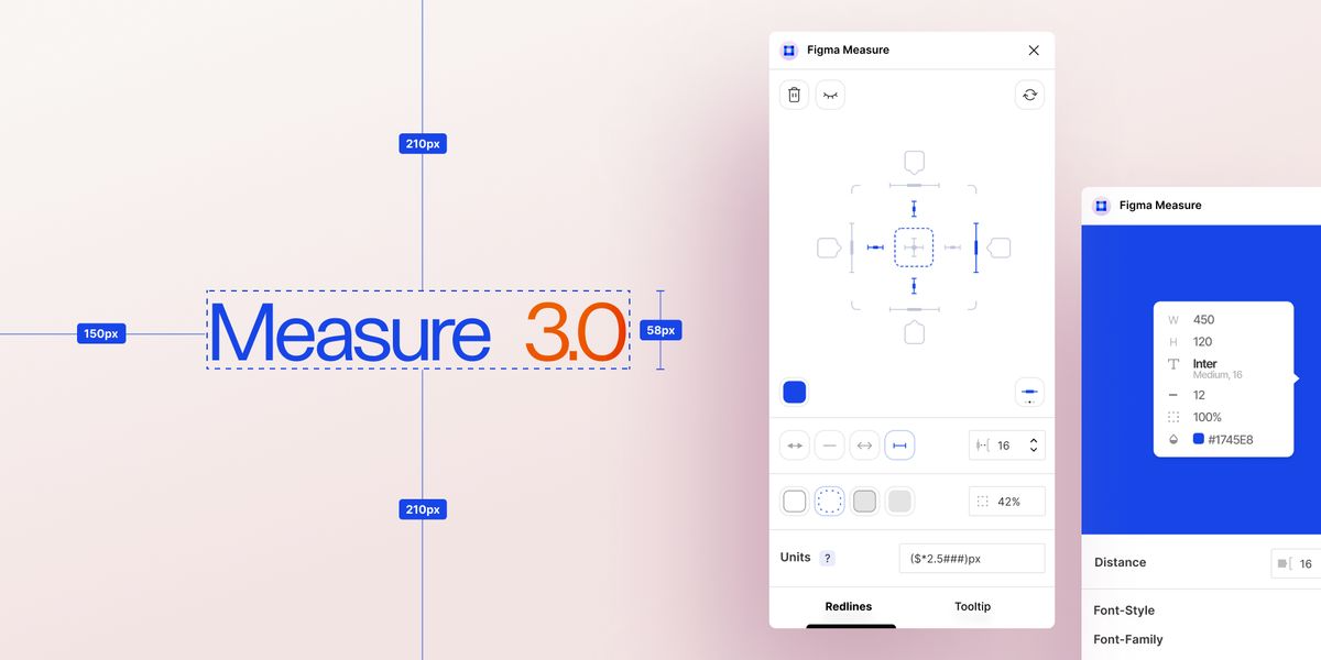
Part 1: Practicing the Right Way (Precision Over Guessing)
data-path-to-node=”11″>Most beginners build websites by approximation. They open Figma and think: “This looks close enough.”
But professional companies expect accuracy. Even a 5px inconsistency can make a website look unprofessional.
When you practice, always:
Measure container width (1200px? 1320px? 1400px?)
Check section padding (Top/Bottom, Left/Right)
Check margin spacing between sections
Match font sizes exactly
Follow the design alignment grid
Why? Because design consistency builds visual trust. Professional developers do not guess spacing—they measure it.
Part 2: Understanding Containers and Flexbox (Modern Structure)
Section → Column → Inner Section → Widget This created heavy structure and unnecessary nesting.
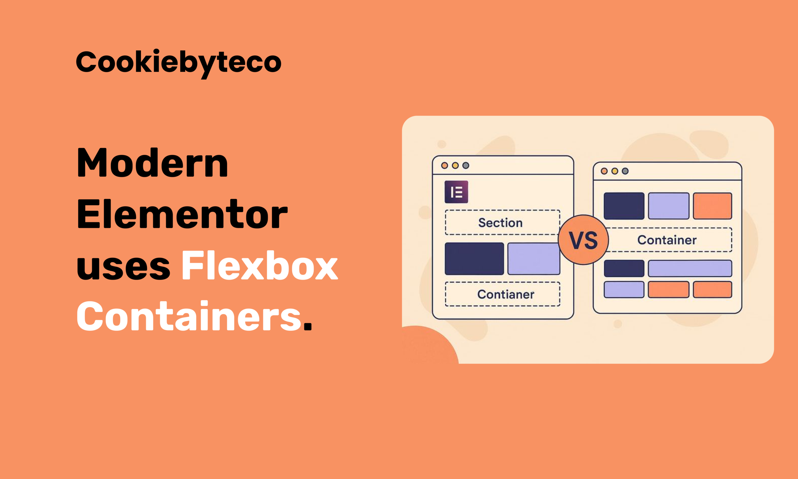
Why is this important?
Gives better alignment control (
justify-content,align-items)Reduces extra div wrappers (Cleaner DOM)
Makes responsive adjustments easier
Keeps the website lighter and faster
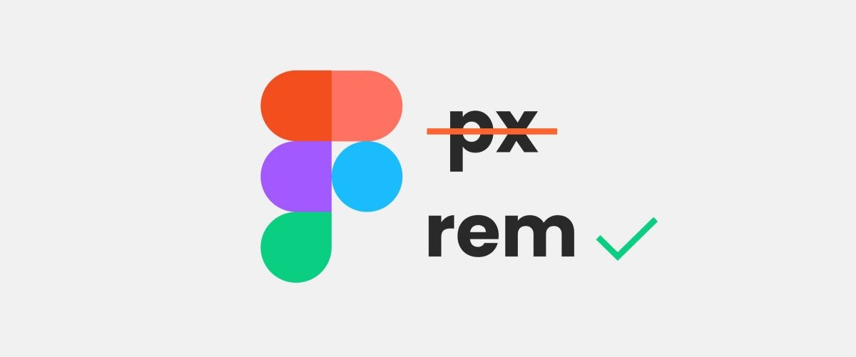
Part 3: Using REM Instead of PX (Scalable System Thinking)
Many beginners use PX for everything. Professional builds use REM.
The Logic: If you set in CSS:
CSS
html { font-size: 62.5%; }
Then:
1rem=10pxFigma 24px →
2.4remFigma 36px →
3.6rem
Part 4: Responsive Testing Beyond Mobile Toggle
Do not only switch Elementor to “Mobile View”. Professional testing means manually resizing the browser from full width down to 320px.
Check for:
Navigation wrapping (Menu breaking into two lines)
Button breaking or text overflowing
Grid stacking behavior
Consistent padding on Tablet and Mobile
Responsiveness is not just about “Mobile View”—it is about fluid behavior across all screen sizes.
Part 5: Global Setup Before Design (System First)
Beginners start dragging widgets immediately. Professionals start by setting up the system.
Before building any page, configure:
Global Colors (Primary, Secondary, Text, Accent)
Global Typography (H1, H2, H3, Body Text)
Base Font Size (HTML root setting)
Container Width (Layout Settings)
Button Styles (Default padding, radius, typography)
Why? If you manually style every section, the design becomes inconsistent. System-based design is scalable; manual styling is messy.
What Type of Document Companies Usually Provide Before Hiring
Before you are hired as a WordPress Developer, most professional agencies will provide a structured project instruction document.
This is not just a simple task brief.
It usually includes:
• Hosting access details
• WordPress setup instructions
• Required plugins
• Theme configuration
• Global CSS rules
• Container width guidelines
• Spacing system
• REM typography structure
• Responsive breakpoints
• QA and testing checklist
This document explains not only what to build —
but how to build it professionally.
Sample Instruction Document (Practice First)
I already have a sample project instruction document.
This is not something randomly created.
I have applied to multiple large agencies and international companies, and I have received similar structured documents during their hiring process.
This sample document is created based on real experience and patterns gathered from professional agency workflows.
It reflects how serious companies structure their development standards.
Before applying to any company, you should:
• Read this document carefully
• Understand every section
• Practice implementing it
• Follow it exactly as written
Do not skip anything.
Treat this document as if you were already hired and assigned a real project.
After Reading the Document – Move to Figma Practice
Once you understand the document structure, then move to design practice.
Practice at least 2 to 5 full homepage designs properly.
Not partially.
Not approximately.
Build them accurately.
Focus on:
• Exact spacing
• Correct container width
• Proper padding
• Typography in REM
• Clean layout structure
When you can convert 2–5 Figma designs precisely, you are no longer a beginner.
You are project-ready.
Mandatory Responsive Breakpoints (You Must Practice These)
When practicing, always follow these 5 breakpoints:
• Desktop – 1200px and above
• Tablet Extra – 992px to 1199px
• Tablet – 768px to 991px
• Mobile Extra – 481px to 767px
• Mobile – 480px and below
Do not only check Elementor mobile view.
Manually resize the browser from full desktop down to 320px.
Check:
• Navigation wrapping
• Button alignment
• Text readability
• Column stacking
• Consistent padding
Professional agencies test responsiveness carefully.
You must train yourself the same way.