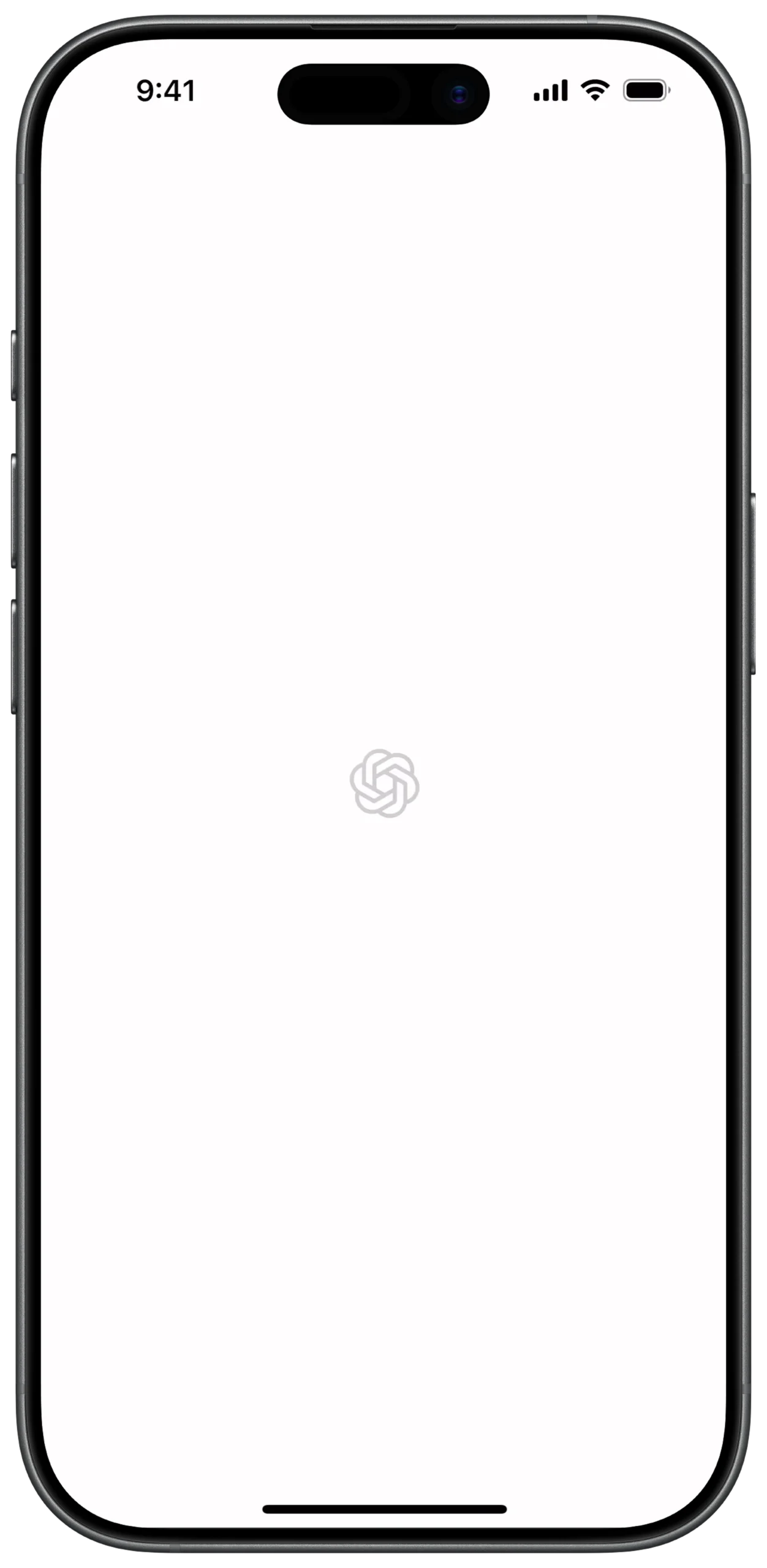
① SCREEN ROOT STRUCTURE
Scaffold
→ BackgroundColor: White
→ SafeArea
→ Center
→ (Ensures logo stays perfectly centered on screen)
② MAIN LAYOUT STRUCTURE
Center
→ Column
→ MainAxisAlignment: center
→ (Used to vertically stack elements if needed)
③ BRAND LOGO SECTION
Column
→ SizedBox
→ width: (Fixed logo width)
→ height: (Fixed logo height)
→ Image.asset
→ Asset: ChatGPT / OpenAI Logo
→ Fit: Contain
→ Color: Grey / Silver
→ Opacity: Slightly reduced (Subtle loading effect)
④ THEME & VISUAL STYLE
Scaffold
→ BackgroundColor: White
→ Overall Style:
→ Minimal
→ Clean
→ Distraction-free
→ Focused on brand presence
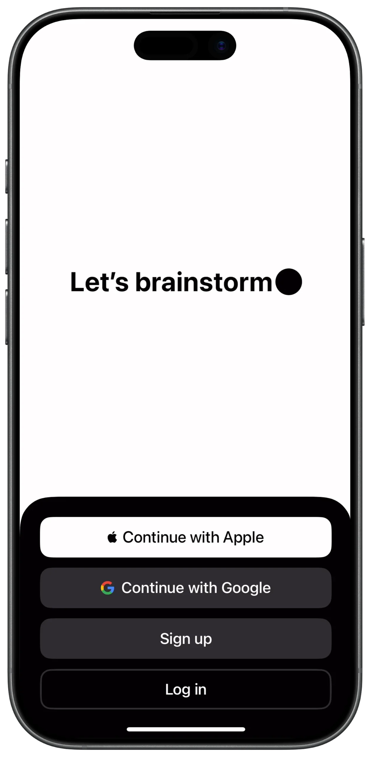
① SCREEN ROOT STRUCTURE
Scaffold
→ SafeArea
→ Stack
② STACK LAYOUT LOGIC
Stack
→ Top Layer
→ Main screen content
→ Bottom Layer
→ Black overlay menu
③ MAIN CANVAS SECTION (Top Content)
Stack
→ SafeArea
→ Column (Main Layout)
→ Spacer
TOP SPACING CONTROL
Column
→ Spacer
④ HEADLINE AREA
Column
→ Row
→ MainAxisAlignment.center
→ Text
→ "Let's brainstorm"
→ FontWeight.bold
→ SizedBox
→ width: 10
→ Container
→ Shape: Circle
→ Color: Black
→ (Decorative dot)
⑤ BOTTOM FLEX SPACER
Column
→ Spacer
⑥ BOTTOM OVERLAY CONTAINER (BLACK)
Stack
→ Positioned
→ bottom: 0
→ Container
→ Color: Black
→ BorderRadius
→ TopLeft + TopRight rounded
⑦ OVERLAY CONTENT WRAPPER
Black Container
→ Padding
→ Column
→ (All action items vertically stacked)
⑧ SOCIAL & ACCOUNT ACTION BUTTONS (COMBINED
→ Container
→ White Button
→ Row (Center)
→ Icon (Apple)
→ SizedBox (width: 8)
→ Text ("Continue with Apple", Black)
→ SizedBox (height: 12)
→ Container
→ Dark Grey Button
→ Row (Center)
→ Image (Google)
→ SizedBox (width: 8)
→ Text ("Continue with Google", White)
⑨ SOCIAL & ACCOUNT ACTION BUTTONS (COMBINED
→ SizedBox (height: 12)
→ Container
→ Medium Grey Button
→ Center
→ Text ("Sign up", White)
→ SizedBox (height: 12)
→ Container
→ Transparent / Near Black Button
→ Center
→ Text ("Log in", White)
⑩ BUTTON SPACING & FLOW CONTROL
Column
→ SizedBox
→ (Used repeatedly for vertical spacing consistency)
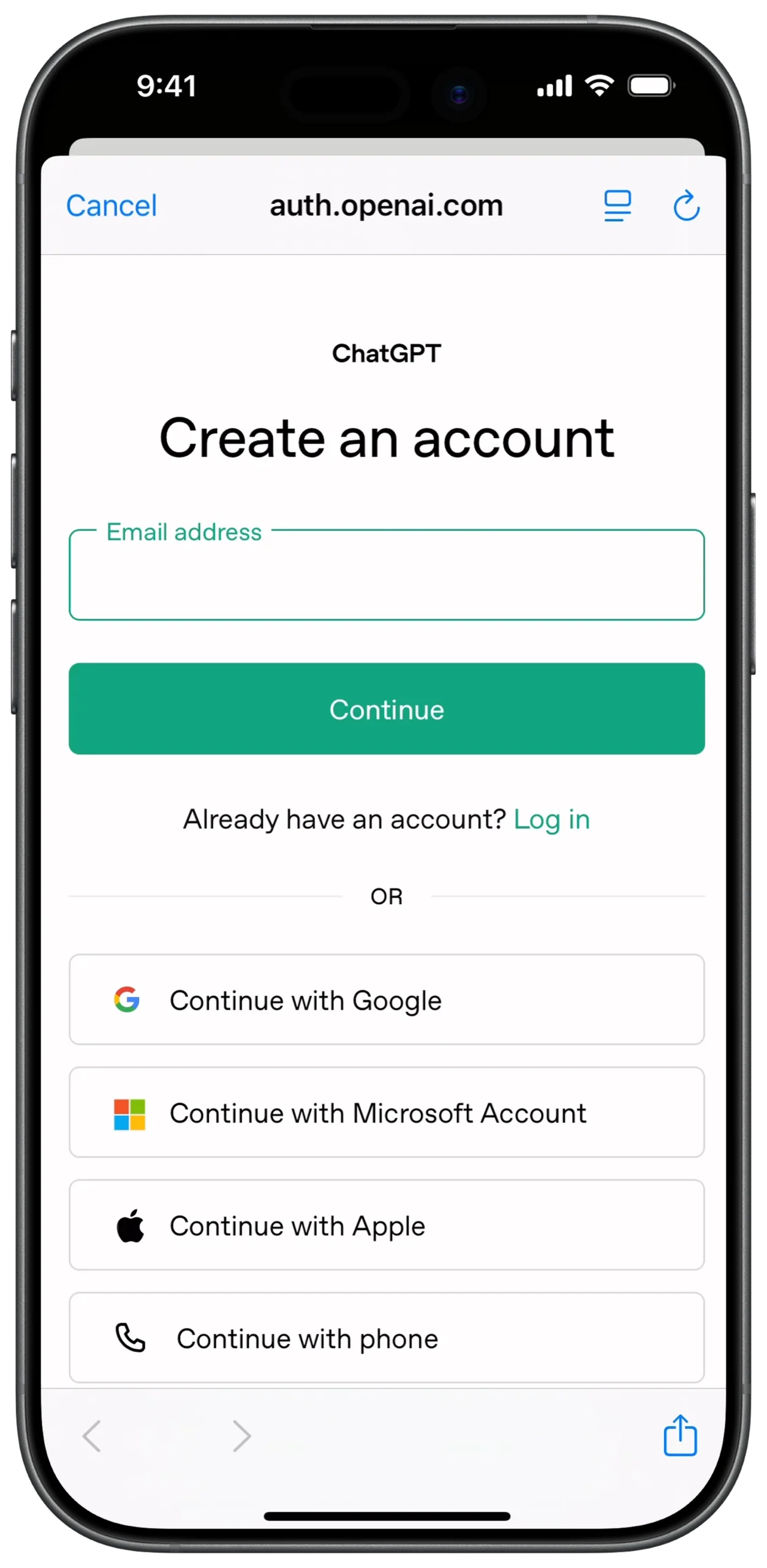
① SCREEN ROOT STRUCTURE
Scaffold
→ SafeArea
→ Column
→ (Main Parent Container for entire screen)
② TOP BROWSER BAR (URL + ACTIONS)
Column
→ Padding
→ Row
→ TextButton
→ "Cancel"
→ Expanded
→ Row (Center)
→ Text
→ https://www.google.com/search?q=auth.openai.com
→ Icon
→ Desktop / Share
③ LOGO & BRANDING SECTION
Column
→ SizedBox
→ height: 40
→ Center
→ Text
→ "ChatGPT"
→ Style: Bold, Small
④ MAIN HEADLINE & CONTEXT
Column
→ SizedBox
→ height: 20
→ Center
→ Text
→ "Create an account"
→ Style: Headline (H1)
⑤ EMAIL INPUT FIELD (PRIMARY INPUT)
Column
→ Padding
→ Stack
→ (Purpose: Label overlay on border)
→ Container
→ Border: Green
→ Radius: 8
→ TextField
→ Hint: "Email address"
⑥ PRIMARY ACTION BUTTON (CONTINUE)
Column
→ SizedBox
→ height: 20
→ Padding
→ SizedBox
→ width: double.infinity
→ ElevatedButton
→ Background: Green
→ Text
→ "Continue"
→ Color: White
⑦ LOGIN REDIRECT (SECONDARY TEXT ACTION)
Column
→ SizedBox
→ height: 20
→ Row (Center)
→ Text
→ "Already have an account?"
→ TextButton
→ "Log in"
→ Color: Green
⑧ DIVIDER / SEPARATOR SECTION
Column
→ Row (Center)
→ Expanded
→ Divider
→ Padding
→ Text
→ "OR"
→ Expanded
→ Divider
⑨ SOCIAL AUTH OPTIONS (GOOGLE / MICROSOFT / APPLE)
Column
→ ListView
→ shrinkWrap: true
→ Container
→ White Button with Border
→ Row
→ Image
→ Google / Microsoft / Apple Icon
→ Expanded
→ Center
→ Text
→ "Continue with ..."
⑩ PHONE AUTH OPTION
Column
→ Container
→ White Button with Border
→ Row
→ Icon
→ Phone Icon
→ Expanded
→ Center
→ Text
→ "Continue with phone"
⑪ BOTTOM BROWSER ACTION BAR
Column
→ Container
→ White Button with Border
→ Row
→ Icon
→ Phone Icon
→ Expanded
→ Center
→ Text
→ "Continue with phone"
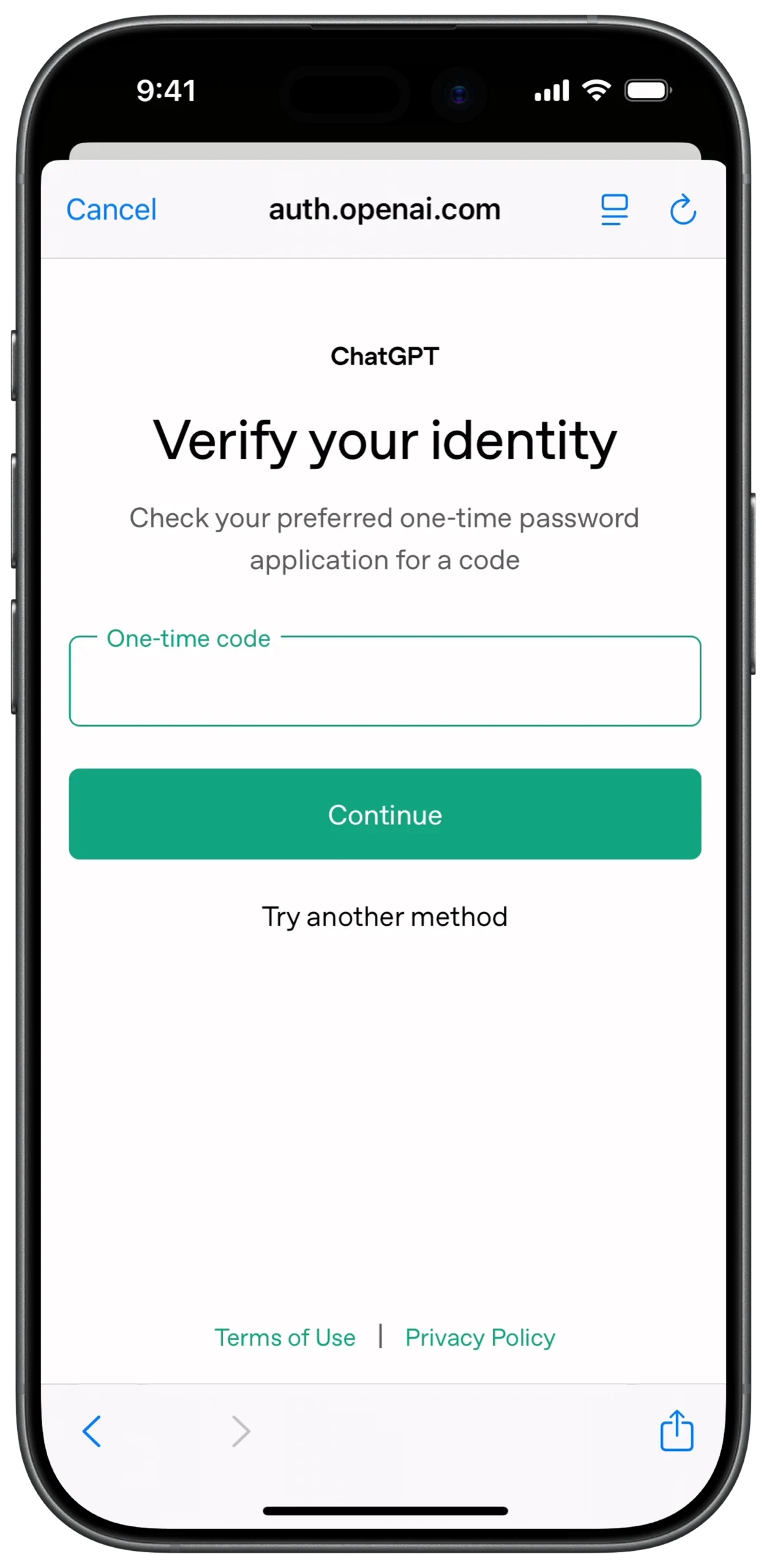
① SCREEN ROOT STRUCTURE
Scaffold
→ SafeArea
→ (Ensures content stays within visible screen area)
→ Column
→ (Primary vertical axis for all screen elements)
② TOP BROWSER BAR (URL + CONTROLS)
Column
→ Padding
→ (Horizontal breathing room)
→ Row
→ TextButton
→ "Cancel"
→ Expanded
→ Row (Center)
→ Icon
→ Lock / Security symbol
→ SizedBox
→ width: 5
→ Text
→ https://www.google.com/search?q=auth.openai.com
→ IconButton
→ Refresh / Options
③ BRANDING & PRODUCT IDENTITY
Column
→ SizedBox
→ height: 40
→ Center
→ Text
→ "ChatGPT"
→ (Secondary branding title)
④ MAIN VERIFICATION CONTEXT (HEADLINE + INSTRUCTION)
Column
→ SizedBox
→ height: 20
→ Center
→ Text
→ "Verify your identity"
→ Style: Bold H1
→ SizedBox
→ height: 10
→ Padding
→ Horizontal: 40
→ Text
→ "Check your preferred one-time password..."
→ Color: Grey
⑤ ONE-TIME CODE INPUT AREA (PRIMARY FORM)
Column
→ SizedBox
→ height: 30
→ Padding
→ Horizontal: 20
→ Container
→ Border: Green
→ BorderRadius: 8
→ Padding
→ Internal spacing
→ TextField
→ Input: One-time code
→ InputDecoration
→ Label: "One-time code"
→ (Floating on border)
⑥ PRIMARY & SECONDARY ACTIONS (COMBINED)
Column
→ SizedBox
→ height: 20
→ Padding
→ Horizontal: 20
→ SizedBox
→ width: double.infinity
→ ElevatedButton
→ Background: Green
→ Shape: Rounded
→ Text
→ "Continue"
→ Color: White
→ SizedBox
→ height: 15
→ Center
→ TextButton
→ "Try another method"
→ Style: Plain grey/black
⑦ FOOTER LEGAL LINKS
Column
→ Spacer
→ (Pushes footer to bottom of content area)
→ Row (Center)
→ TextButton
→ "Terms of Use"
→ Text
→ " | "
→ Color: Grey
→ TextButton
→ "Privacy Policy"
→ SizedBox
→ height: 20
① SCREEN ROOT STRUCTURE
Scaffold
→ SafeArea
→ Padding (Overall page margin)
→ Column (Main vertical layout axis)
② INFO ITEM — ACCURACY
Column
→ SizedBox (height: 40)
→ Row
→ Icon (Flag, Outline style)
→ SizedBox (width: 20)
→ Expanded
→ Column
→ Text
→ "Responses can be inaccurate"
→ Style: Bold
→ Text
→ "ChatGPT may provide inaccurate information..."
→ Style: Grey body text
③ INFO ITEM — ACCURACY
Column
→ SizedBox (height: 40)
→ Row
→ Icon (Flag, Outline style)
→ SizedBox (width: 20)
→ Expanded
→ Column
→ Text
→ "Responses can be inaccurate"
→ Style: Bold
→ Text
→ "ChatGPT may provide inaccurate information..."
→ Style: Grey body text
④ INFO ITEM — PRIVACY
Column
→ SizedBox (height: 30)
→ Row
→ Icon (Lock, Outline style)
→ SizedBox (width: 20)
→ Expanded
→ Column
→ Text
→ "Don’t share sensitive info"
→ Style: Bold
→ RichText
→ TextSpan
→ "Chats may be reviewed..."
→ TextSpan
→ "Learn more"
→ Style: Underlined / Link
⑤ LEGAL FOOTER SECTION
Column
→ SizedBox (height: 20)
→ Center
→ RichText
→ TextSpan
→ "By continuing, you agree to our "
→ TextSpan
→ "Terms"
→ Style: Bold / Link
→ TextSpan
→ " and have read our "
→ TextSpan
→ "Privacy Policy"
→ Style: Bold / Link
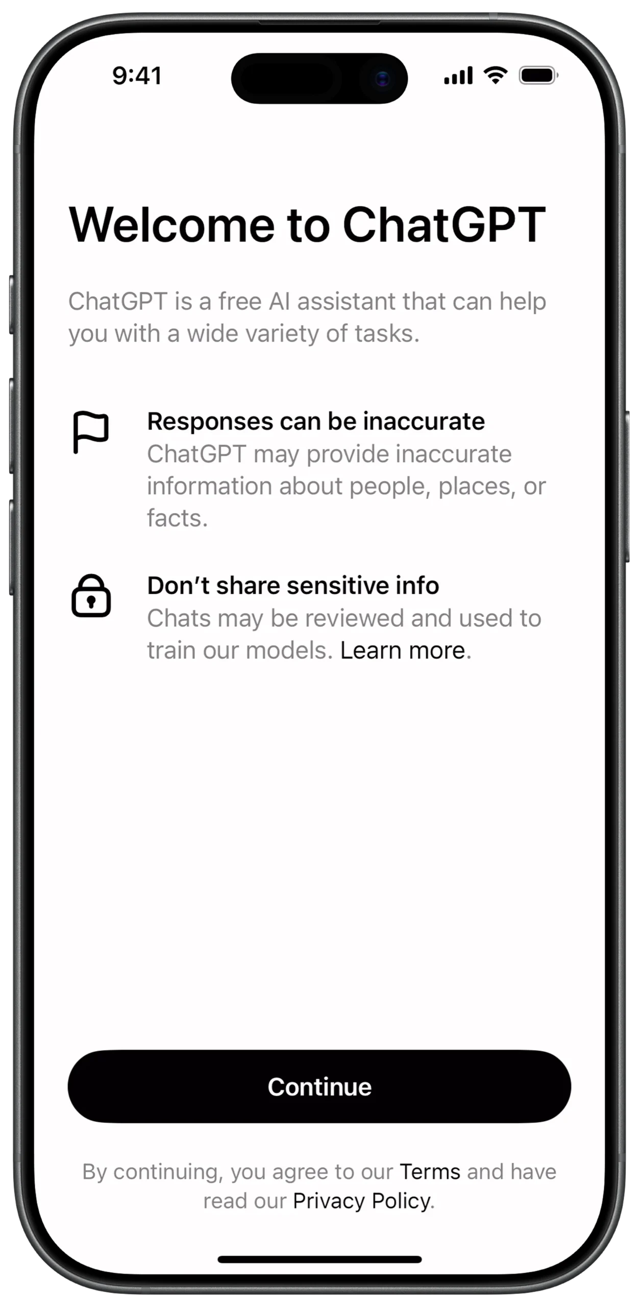
① WELCOME HEADER SECTION
Column
→ Text
→ "Welcome to ChatGPT"
→ Style: Large, Bold
→ SizedBox (height: 20)
→ Text
→ "ChatGPT is a free AI assistant..."
→ Style: Grey, Body text
② MAIN LAYOUT STRUCTURE
Center
→ Column
→ MainAxisAlignment: center
→ (Used to vertically stack elements if needed)
③ INFO ITEM — ACCURACY
Column
→ SizedBox (height: 40)
→ Row
→ Icon (Flag, Outline style)
→ SizedBox (width: 20)
→ Expanded
→ Column
→ Text
→ "Responses can be inaccurate"
→ Style: Bold
→ Text
→ "ChatGPT may provide inaccurate information..."
→ Style: Grey body text
④ INFO ITEM — PRIVACY
Column
→ SizedBox (height: 30)
→ Row
→ Icon (Lock, Outline style)
→ SizedBox (width: 20)
→ Expanded
→ Column
→ Text
→ "Don’t share sensitive info"
→ Style: Bold
→ RichText
→ TextSpan
→ "Chats may be reviewed..."
→ TextSpan
→ "Learn more"
→ Style: Underlined / Link
⑤ LEGAL FOOTER SECTION
Column
→ SizedBox (height: 20)
→ Center
→ RichText
→ TextSpan
→ "By continuing, you agree to our "
→ TextSpan
→ "Terms"
→ Style: Bold / Link
→ TextSpan
→ " and have read our "
→ TextSpan
→ "Privacy Policy"
→ Style: Bold / Link
① SCREEN ROOT & MAIN SCROLL STRUCTURE
Scaffold
→ SafeArea
→ SingleChildScrollView (Vertical scrolling for full page)
→ Column (Main vertical layout axis)
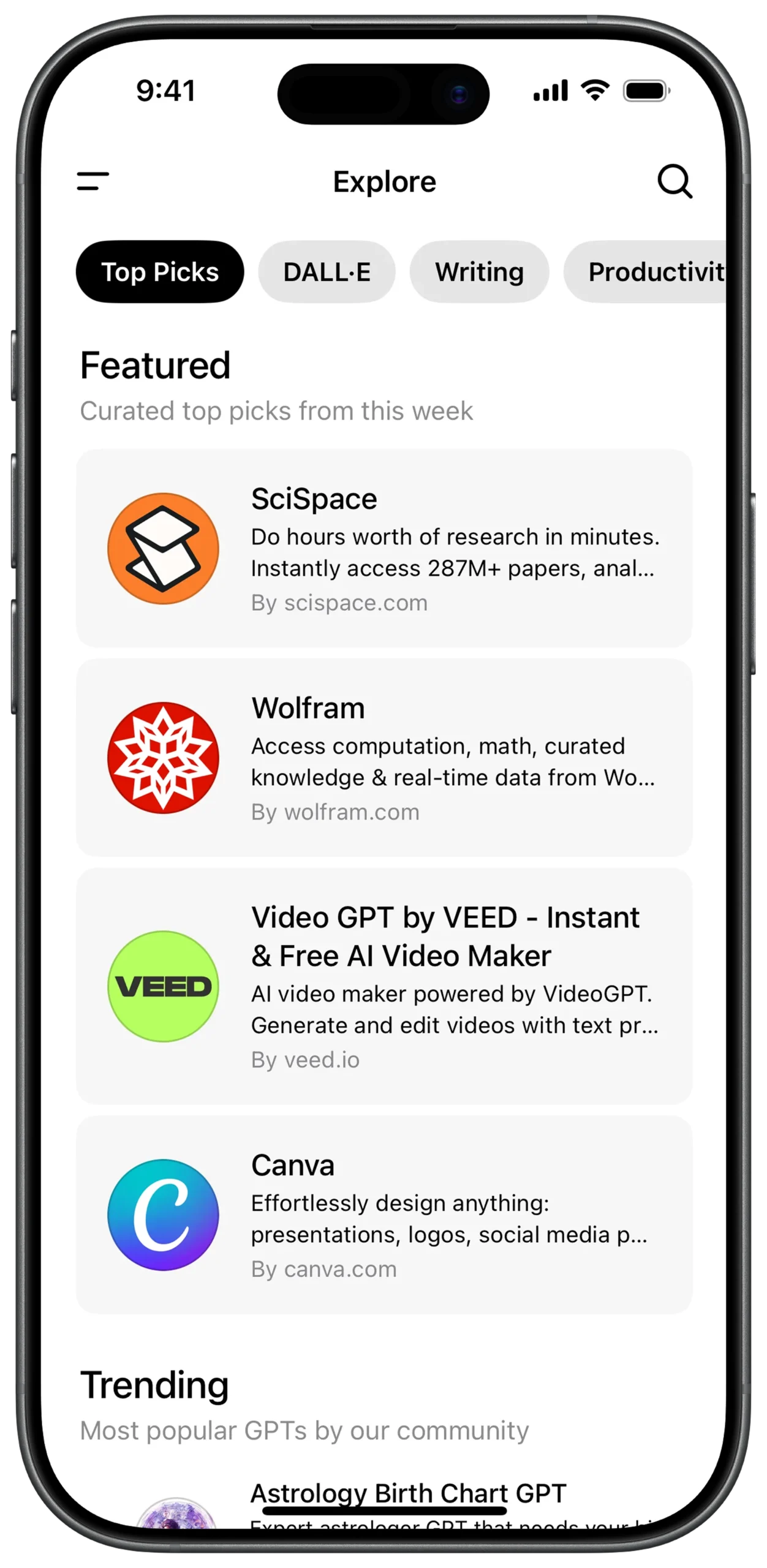
② TOP NAVIGATION BAR
Column
→ Padding (Horizontal spacing)
→ Row
→ Icon (Menu / Hamburger)
→ Spacer
→ Text
→ "Explore"
→ Style: Bold (Center title)
→ Spacer
→ Icon (Search)
③ CATEGORY SELECTOR (HORIZONTAL SCROLL)
Column
→ SizedBox (height: 20)
→ SingleChildScrollView
→ ScrollDirection: Horizontal
→ Padding (Left alignment)
→ Row
→ Container (Active Chip)
→ Background: Black
→ Text
→ "Top Picks"
→ Color: White
→ SizedBox (width: 8)
→ Container (Inactive Chip)
→ Background: Light Grey
→ Text
→ "DALL·E"
→ SizedBox (width: 8)
→ Container (Inactive Chip)
→ Background: Light Grey
→ Text
→ "Writing"
④ SECTION HEADER — FEATURED
Column
→ SizedBox (height: 25)
→ Padding (Side alignment)
→ Column
→ Text
→ "Featured"
→ Style: Large Bold
→ Text
→ "Curated top picks from this week"
→ Color: Grey
⑤ FEATURED ITEMS (CARD COMPONENT STRUCTURE)
Column
→ SizedBox (height: 15)
→ Container (Card Style)
→ Background: Light Grey
→ BorderRadius: Rounded
→ Padding (Internal spacing)
→ Row
→ Logo (Image.network / CircleAvatar)
→ SizedBox (width: 15)
→ Expanded
→ Column
→ Text (Title - Bold)
→ Text
→ Description
→ MaxLines: 2
→ Text
→ "By domain.com"
→ Color: Grey
⑥ SECTION HEADER — TRENDING
Column
→ SizedBox (height: 30)
→ Padding
→ Column
→ Text
→ "Trending"
→ Style: Large Bold
→ Text
→ "Most popular GPTs by our community"
→ Color: Grey
⑦ REUSABLE CARD VARIATIONS (LOGO TYPES)
Logo Option 1:
→ Image.network (SciSpace / Wolfram style logo)
Logo Option 2:
→ CircleAvatar
→ BackgroundColor / Gradient
→ Text / Initial (Example: "VEED", "C")
① SCREEN ROOT & MAIN SCROLL STRUCTURE
Scaffold
→ SafeArea
→ SingleChildScrollView (Vertical scrolling for full page)
→ Column (Main vertical layout axis)
② TOP NAVIGATION BAR
Column
→ Padding (Horizontal spacing)
→ Row
→ Icon (Menu / Hamburger)
→ Spacer
→ Text
→ "Explore"
→ Style: Bold (Center title)
→ Spacer
→ Icon (Search)
③ CATEGORY SELECTOR (HORIZONTAL SCROLL)
Column
→ SizedBox (height: 20)
→ SingleChildScrollView
→ ScrollDirection: Horizontal
→ Padding (Left alignment)
→ Row
→ Container (Active Chip)
→ Background: Black
→ Text
→ "Top Picks"
→ Color: White
→ SizedBox (width: 8)
→ Container (Inactive Chip)
→ Background: Light Grey
→ Text
→ "DALL·E"
→ SizedBox (width: 8)
→ Container (Inactive Chip)
→ Background: Light Grey
→ Text
→ "Writing"
④ FEATURED ITEMS (CARD COMPONENT STRUCTURE)
Column
→ SizedBox (height: 15)
→ Container (Card Style)
→ Background: Light Grey
→ BorderRadius: Rounded
→ Padding (Internal spacing)
→ Row
→ Logo (Image.network / CircleAvatar)
→ SizedBox (width: 15)
→ Expanded
→ Column
→ Text (Title - Bold)
→ Text
→ Description
→ MaxLines: 2
→ Text
→ "By domain.com"
→ Color: Grey
⑤ SECTION HEADER — TRENDING
Column
→ SizedBox (height: 30)
→ Padding
→ Column
→ Text
→ "Trending"
→ Style: Large Bold
→ Text
→ "Most popular GPTs by our community"
→ Color: Grey
⑥ REUSABLE CARD VARIATIONS (LOGO TYPES)
Logo Option 1:
→ Image.network (SciSpace / Wolfram style logo)
Logo Option 2:
→ CircleAvatar
→ BackgroundColor / Gradient
→ Text / Initial (Example: "VEED", "C")
⑦ OVERALL UI CHARACTERISTICS
Design Style:
→ Clean
→ Card-based layout
→ Soft rounded corners
→ Light grey surfaces
→ Clear content hierarchy
UX Behavior:
→ Vertical full-page scroll
→ Horizontal category scroll
→ Reusable card components
→ Expandable for more sections
① SCREEN ROOT STRUCTURE (LAYERED LAYOUT)
Scaffold
→ SafeArea
→ Stack
→ (Used to layer dismiss button and badge over content)
② MAIN SCROLLABLE BODY
Stack
→ SingleChildScrollView (Vertical)
→ Padding (Page margins)
→ Column (Main layout container)
③ TOP DISMISS ACTION (OVERLAY)
Stack
→ Positioned
→ Top: 10
→ Right: 10
→ IconButton
→ Icon: Close (X)
→ Action: Exit subscription flow
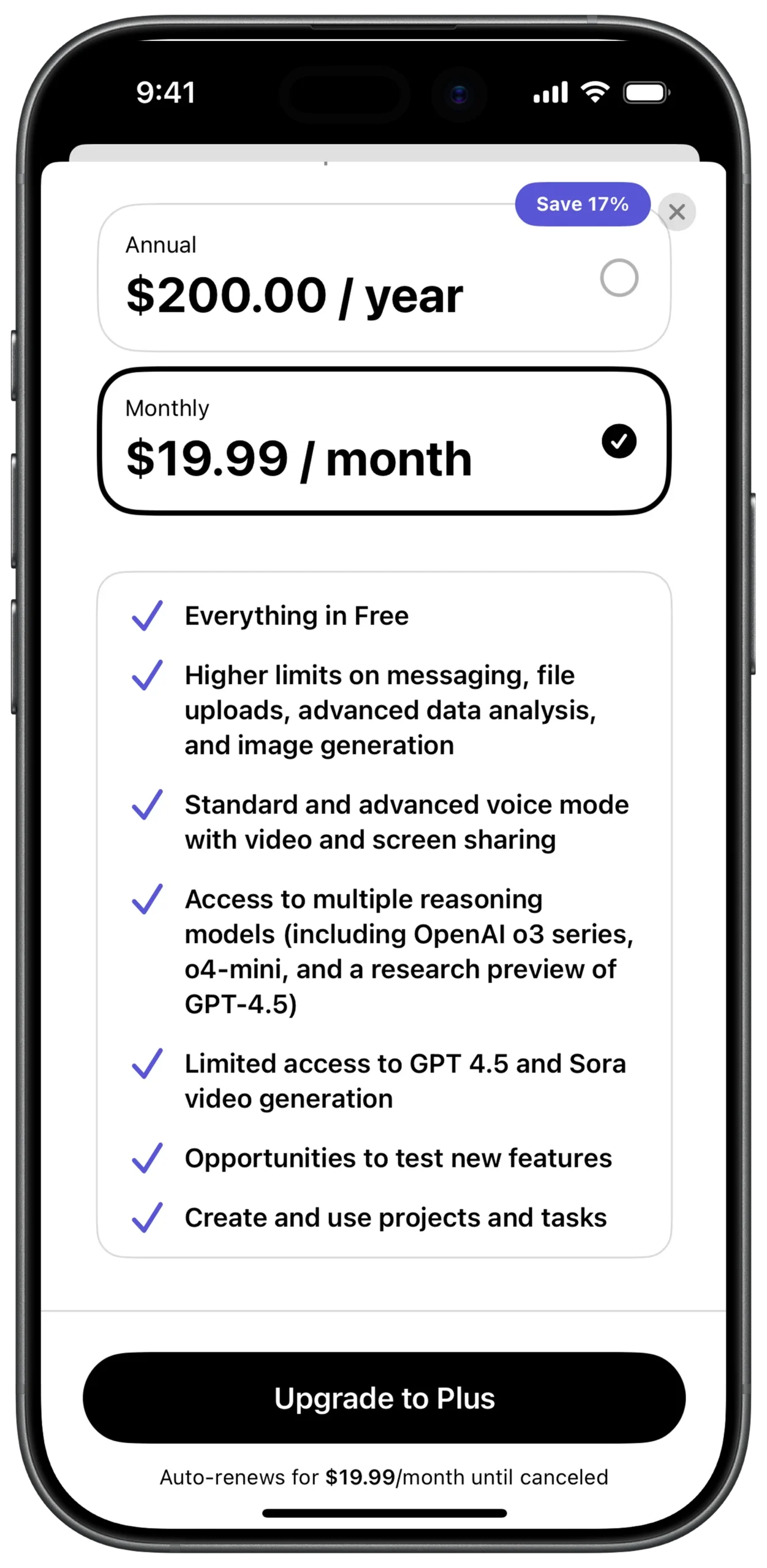
④ ANNUAL PRICING CARD (WITH DISCOUNT BADGE)
Column
→ Stack (For badge overlay)
→ Positioned
→ Top: -10
→ Right: 20
→ Container
→ Background: Blue / Purple
→ BorderRadius: 20
→ Text: "Save 17%"
→ Container (Pricing Card)
→ Border: Light Grey
→ BorderRadius: 15
⑤ ANNUAL PRICING CARD (WITH DISCOUNT BADGE)
→ Padding
→ Row
→ Column (Left aligned)
→ Text
→ "Annual"
→ Style: Small
→ Text
→ "$200.00 / year"
→ Style: Bold / Large
→ Spacer
→ Icon
→ Radio Button (Unchecked)
⑥ MONTHLY PRICING CARD (ACTIVE)
Column
→ SizedBox (height: 15)
→ Container
→ Border: Black
→ StrokeWidth: 2
→ BorderRadius: 15
→ Padding
→ Row
→ Column
→ Text
→ "Monthly"
→ Style: Small
→ Text
→ "$19.99 / month"
→ Style: Bold / Large
→ Spacer
→ Icon
→ Check Circle (Checked)
⑦ PLAN FEATURES CONTAINER
Column
→ SizedBox (height: 25)
→ Container
→ Border: Light Grey
→ BorderRadius: 15
→ Background: Transparent
→ Padding
→ Column
→ (Vertical list of feature items)
⑧ FEATURE ITEM STRUCTURE (REUSABLE COMPONENT)
Column (Inside Features)
→ Row
→ Icon
→ Checkmark
→ Color: Blue / Purple
→ SizedBox (width: 15)
→ Expanded
→ Text
→ Feature description
⑨ PRIMARY UPGRADE BUTTON (BOTTOM ACTION)
Column
→ Padding (Bottom: 20)
→ SizedBox
→ width: double.infinity
→ ElevatedButton
→ BackgroundColor: Black
→ Shape: Stadium (Fully rounded)
→ Text
→ "Upgrade to Plus"
→ Color: White
⑩ RENEWAL FOOTER & SYSTEM INDICATOR
Column
→ Center
→ Text
→ "Auto-renews for $19.99/month until canceled"
→ Style: Very Small / Grey
→ SizedBox (height: 10)
→ Center
→ Container
→ Height: 5
→ Width: 135
→ BorderRadius: Rounded
→ Color: Black
→ (iOS Home Indicator)
① SCREEN ROOT STRUCTURE (LAYERED LAYOUT)
Scaffold
→ SafeArea
→ Stack
→ (Used to layer dismiss button and badge over content)
② MAIN SCROLLABLE BODY
Stack
→ SingleChildScrollView (Vertical)
→ Padding (Page margins)
→ Column (Main layout container)
③ TOP DISMISS ACTION (OVERLAY)
Stack
→ Positioned
→ Top: 10
→ Right: 10
→ IconButton
→ Icon: Close (X)
→ Action: Exit subscription flow
④ ANNUAL PRICING CARD (WITH DISCOUNT BADGE)
Column
→ Stack (For badge overlay)
→ Positioned
→ Top: -10
→ Right: 20
→ Container
→ Background: Blue / Purple
→ BorderRadius: 20
→ Text: "Save 17%"
→ Padding
→ Row
→ Column (Left aligned)
→ Text
→ "Annual"
→ Style: Small
→ Text
→ "$200.00 / year"
→ Style: Bold / Large
→ Spacer
→ Icon
→ Radio Button (Unchecked)
→ Container (Pricing Card)
→ Border: Light Grey
→ BorderRadius: 15
⑤ MONTHLY PRICING CARD (ACTIVE)
Column
→ SizedBox (height: 15)
→ Container
→ Border: Black
→ StrokeWidth: 2
→ BorderRadius: 15
→ Padding
→ Row
→ Column
→ Text
→ "Monthly"
→ Style: Small
→ Text
→ "$19.99 / month"
→ Style: Bold / Large
→ Spacer
→ Icon
→ Check Circle (Checked)
⑥ PLAN FEATURES CONTAINER
Column
→ SizedBox (height: 25)
→ Container
→ Border: Light Grey
→ BorderRadius: 15
→ Background: Transparent
→ Padding
→ Column
→ (Vertical list of feature items)
⑦ FEATURE ITEM STRUCTURE (REUSABLE COMPONENT)
Column (Inside Features)
→ Row
→ Icon
→ Checkmark
→ Color: Blue / Purple
→ SizedBox (width: 15)
→ Expanded
→ Text
→ Feature description
⑧ PRIMARY UPGRADE BUTTON (BOTTOM ACTION)
Column
→ Padding (Bottom: 20)
→ SizedBox
→ width: double.infinity
→ ElevatedButton
→ BackgroundColor: Black
→ Shape: Stadium (Fully rounded)
→ Text
→ "Upgrade to Plus"
→ Color: White
⑨ RENEWAL FOOTER & SYSTEM INDICATOR
Column
→ Center
→ Text
→ "Auto-renews for $19.99/month until canceled"
→ Style: Very Small / Grey
→ SizedBox (height: 10)
→ Center
→ Container
→ Height: 5
→ Width: 135
→ BorderRadius: Rounded
→ Color: Black
→ (iOS Home Indicator)
① SCREEN ROOT STRUCTURE
Scaffold
→ SafeArea
→ Column (Main vertical layout axis)
② TOP NAVIGATION BAR
Column
→ Padding (Horizontal spacing)
→ Row
→ IconButton (Menu / Hamburger)
→ Spacer
→ Container (Gradient background, Rounded)
→ Padding (Internal spacing)
→ Row
→ Text
→ "Get Plus"
→ Color: Purple
→ Icon
→ Sparkle symbol
→ Spacer
→ IconButton (New Chat / Square icon)
③ MAIN CHAT CANVAS (EMPTY STATE AREA)
Column
→ Expanded (Takes available middle space)
→ Center
→ SizedBox
→ (Placeholder for branding / empty state graphic)
④ SUGGESTION CHIPS CONTAINER
Column
→ SingleChildScrollView
→ ScrollDirection: Horizontal
→ Padding (Left start spacing)
→ Row
→ (Suggestion chip items)
⑤ SUGGESTION CHIP STRUCTURE (REUSABLE)
Row
→ Container
→ Background: Light Grey
→ BorderRadius: 15
→ Padding
→ Column (CrossAxisAlignment.start)
→ Text (Title - Bold)
→ Text (Subtitle - Grey)
⑥ SUGGESTION ITEM — CREATE PAINTING
Container
→ Text
→ "Create a painting"
→ Style: Bold
→ Text
→ "in Renaissance-style"
→ Color: Grey
⑦ SUGGESTION ITEM — WRITE REPORT
SizedBox (width: 10)
→ Container
→ Text
→ "Write a report"
→ Style: Bold
→ Text
→ "based on my data"
→ Color: Grey
⑧ INPUT FIELD AREA
Column
→ SizedBox (height: 20)
→ Container
→ Background: Light Grey
→ BorderRadius: 30
→ Padding (Horizontal: 15, Vertical: 10)
→ TextField
→ HintText: "Ask anything"
⑨ ATTACHMENT & SETTINGS CONTROLS
Row
→ IconButton
→ Icon: Plus (+)
→ SizedBox (width: 10)
→ IconButton
→ Icon: Sliders (Chat settings)
⑩ VOICE & AUDIO CONTROLS
Row
→ Spacer
→ IconButton
→ Icon: Microphone
→ SizedBox (width: 10)
→ Container
→ Background: Black
→ Shape: Circle
→ IconButton
→ Icon: Audio waveform
→ Color: White
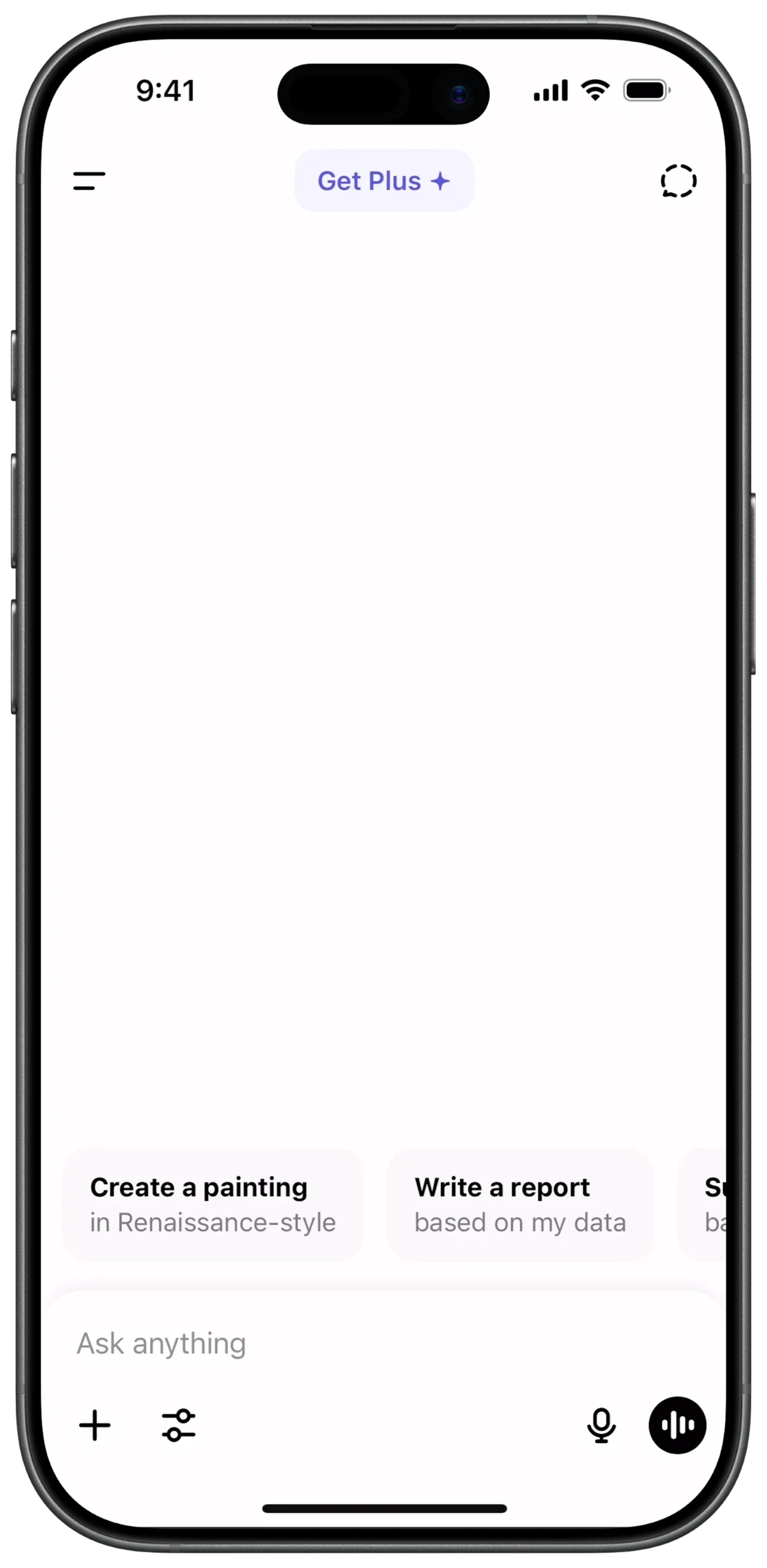
① SCREEN ROOT STRUCTURE
Scaffold
→ SafeArea
→ Column (Main vertical layout axis)
② TOP NAVIGATION BAR
Column
→ Padding (Horizontal spacing)
→ Row
→ IconButton (Menu / Hamburger)
→ Spacer
→ Container (Gradient background, Rounded)
→ Padding (Internal spacing)
→ Row
→ Text
→ "Get Plus"
→ Color: Purple
→ Icon
→ Sparkle symbol
→ Spacer
→ IconButton (New Chat / Square icon)
③ MAIN CHAT CANVAS (EMPTY STATE AREA)
Column
→ Expanded (Takes available middle space)
→ Center
→ SizedBox
→ (Placeholder for branding / empty state graphic)
④ SUGGESTION CHIPS CONTAINER
Column
→ Expanded (Takes available middle space)
→ Center
→ SizedBox
→ (Placeholder for branding / empty state graphic)
⑤ SUGGESTION CHIP STRUCTURE (REUSABLE)
Row
→ Container
→ Background: Light Grey
→ BorderRadius: 15
→ Padding
→ Column (CrossAxisAlignment.start)
→ Text (Title - Bold)
→ Text (Subtitle - Grey)
⑥ SUGGESTION ITEM — CREATE PAINTING
Container
→ Text
→ "Create a painting"
→ Style: Bold
→ Text
→ "in Renaissance-style"
→ Color: Grey
⑦ SUGGESTION ITEM — WRITE REPORT
SizedBox (width: 10)
→ Container
→ Text
→ "Write a report"
→ Style: Bold
→ Text
→ "based on my data"
→ Color: Grey
⑧ INPUT FIELD AREA
Column
→ SizedBox (height: 20)
→ Container
→ Background: Light Grey
→ BorderRadius: 30
→ Padding (Horizontal: 15, Vertical: 10)
→ TextField
→ HintText: "Ask anything"
⑨ ATTACHMENT & SETTINGS CONTROLS
Row
→ IconButton
→ Icon: Plus (+)
→ SizedBox (width: 10)
→ IconButton
→ Icon: Sliders (Chat settings)
⑩ VOICE & AUDIO CONTROLS
Row
→ Spacer
→ IconButton
→ Icon: Microphone
→ SizedBox (width: 10)
→ Container
→ Background: Black
→ Shape: Circle
→ IconButton
→ Icon: Audio waveform
→ Color: White
① SCREEN ROOT STRUCTURE
Scaffold
→ Stack
→ (Layers bottom sheet over main chat interface)
② BOTTOM SHEET POSITIONING LOGIC
Stack
→ Align
→ Alignment: bottomCenter
→ FractionallySizedBox
→ HeightFactor: (Controls sheet height relative to screen)
→ ModalBottomSheet
③ MAIN OVERLAY CONTAINER
ModalBottomSheet
→ Container
→ BackgroundColor: White
→ BorderRadius:
→ TopLeft: Rounded
→ TopRight: Rounded
→ Padding (Internal spacing)
→ Column
→ MainAxisAlignment: start
→ MainAxisSize: min
④ TOOLS HEADER
Column
→ Padding (Top & Bottom spacing)
→ Align
→ Alignment: centerLeft
→ Text
→ "Tools"
→ Style: Bold / Medium
⑤ TOOL ITEM STRUCTURE (REUSABLE COMPONENT)
Column
→ InkWell (Ripple effect on tap)
→ Padding (Vertical spacing)
→ Row
→ Icon (Outline style)
→ SizedBox (width: 15)
→ Text (Standard body style)
⑥ TOOL ITEM — CREATE AN IMAGE
InkWell
→ Row
→ Icon: Paint Palette (Outline)
→ Text: "Create an image"
⑦ TOOL ITEM — SEARCH & RESEARCH OPTIONS
InkWell
→ Row
→ Icon: Globe (Outline)
→ Text: "Search the web"
InkWell
→ Row
→ Icon: Telescope (Outline)
→ Text: "Run deep research"
InkWell
→ Row
→ Icon: Lightbulb (Outline)
→ Text: "Think for longer"
⑧ BACKGROUND DIMMING EFFECT
ModalBottomSheet
→ Property: barrierColor
→ Color: Black
→ Opacity: 0.5 (Dim chat interface behind)
⑨ GESTURE & DISMISS BEHAVIOR
ModalBottomSheet
→ isDismissible: true
→ enableDrag: true
Optional:
→ GestureDetector
→ SwipeDown → Close sheet
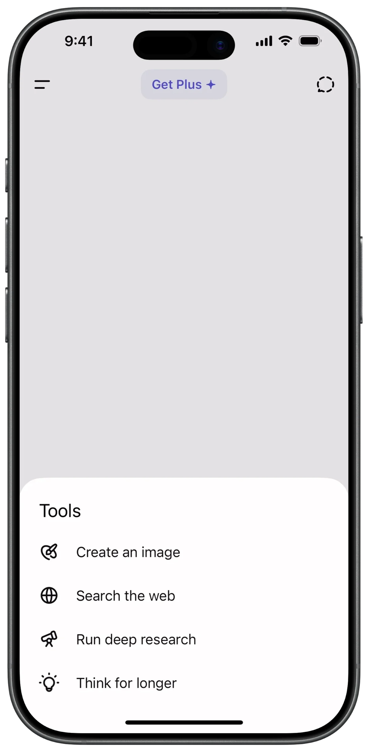
① SCREEN ROOT STRUCTURE
Scaffold
→ Stack
→ (Layers bottom sheet over main chat interface)
② BOTTOM SHEET POSITIONING LOGIC
Stack
→ Align
→ Alignment: bottomCenter
→ FractionallySizedBox
→ HeightFactor: (Controls sheet height relative to screen)
→ ModalBottomSheet
③ MAIN OVERLAY CONTAINER
ModalBottomSheet
→ Container
→ BackgroundColor: White
→ BorderRadius:
→ TopLeft: Rounded
→ TopRight: Rounded
→ Padding (Internal spacing)
→ Column
→ MainAxisAlignment: start
→ MainAxisSize: min
④ TOOLS HEADER
InkWell
→ Row
→ Icon: Paint Palette (Outline)
→ Text: "Create an image"
⑤ TOOL ITEM STRUCTURE (REUSABLE COMPONENT)
Column
→ InkWell (Ripple effect on tap)
→ Padding (Vertical spacing)
→ Row
→ Icon (Outline style)
→ SizedBox (width: 15)
→ Text (Standard body style)
⑥ TOOL ITEM — CREATE AN IMAGE
InkWell
→ Row
→ Icon: Paint Palette (Outline)
→ Text: "Create an image"
⑦ TOOL ITEM — SEARCH & RESEARCH OPTIONS
InkWell
→ Row
→ Icon: Globe (Outline)
→ Text: "Search the web"
InkWell
→ Row
→ Icon: Telescope (Outline)
→ Text: "Run deep research"
InkWell
→ Row
→ Icon: Lightbulb (Outline)
→ Text: "Think for longer"
⑧ BACKGROUND DIMMING EFFECT
ModalBottomSheet
→ Property: barrierColor
→ Color: Black
→ Opacity: 0.5 (Dim chat interface behind)
⑨ GESTURE & DISMISS BEHAVIOR
ModalBottomSheet
→ isDismissible: true
→ enableDrag: true
Optional:
→ GestureDetector
→ SwipeDown → Close sheet
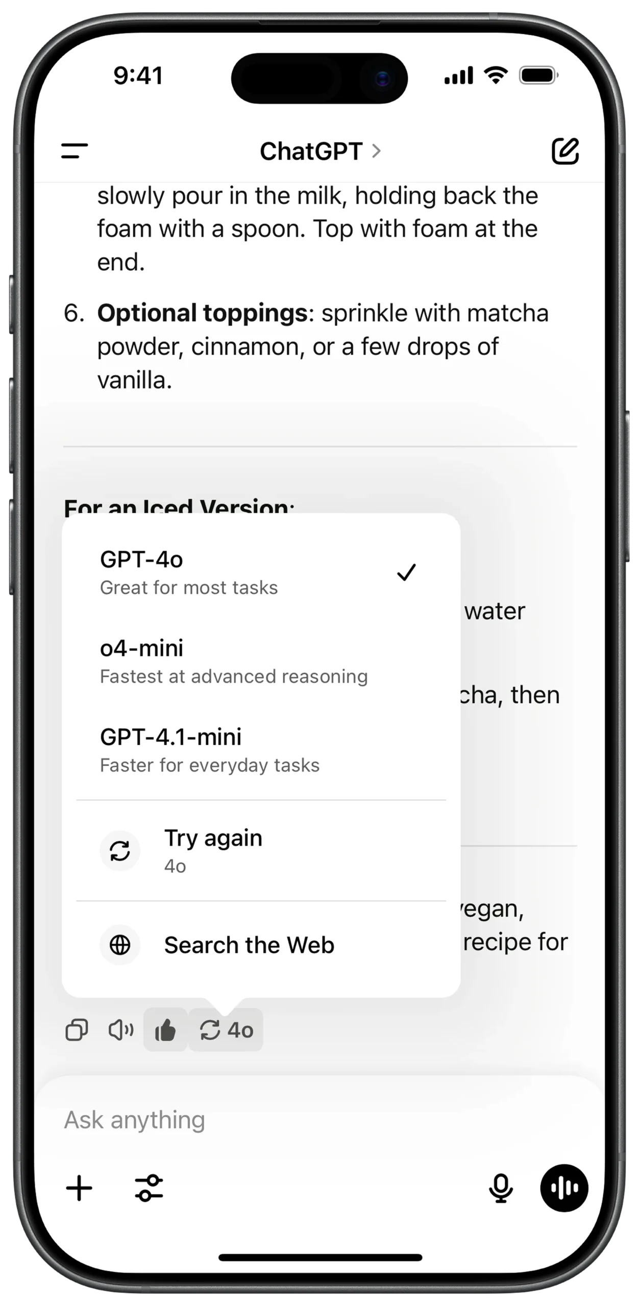
① SCREEN ROOT STRUCTURE
Scaffold
→ SafeArea
→ Stack
→ (Main chat UI + Model selector overlay layered together)
② MAIN CHAT CONTENT AREA
Stack
→ Column (Main vertical layout)
→ Padding
→ Markdown
→ (Handles bold text, lists, formatted recipe/content)
→ Text
→ (Fallback / plain content if needed)
③ MESSAGE ACTION BAR (UNDER CHAT BUBBLE)
Column
→ Row
→ IconButton
→ Copy
→ IconButton
→ Speaker / Read Aloud
→ IconButton
→ Thumbs Up
→ Container (Rounded Border)
→ Padding
→ Row
→ Icon
→ Refresh / Regenerate
→ SizedBox (width: 6)
→ Text
→ "4o" (Current model indicator)
④ MODEL SELECTOR OVERLAY (POP-UP CONTAINER)
Stack
→ Positioned
→ (Placed above message action bar)
→ Container
→ Background: White
→ BorderRadius: 12
→ BoxShadow: Soft shadow
→ Column
→ (Model options + action items)
⑤ SELECTABLE MODEL ITEM (REUSABLE STRUCTURE)
Column (Inside Pop-up)
→ Padding
→ Row
→ Column (CrossAxisAlignment.start)
→ Text (Model Name - Bold)
→ Text (Short Description - Grey)
→ Spacer
→ Icon
→ Checkmark (Visible if selected)
⑥ MODEL OPTION — GPT-4o (SELECTED)
Row
→ Text: "GPT-4o" (Bold)
→ Text: "Great for most tasks" (Grey)
→ Icon: Checkmark (Selected)
⑦ MODEL OPTION — o4-mini
Divider (Thin, light)
→ Row
→ Text: "o4-mini" (Bold)
→ Text: "Fastest at advanced reasoning" (Grey)
⑧ MODEL OPTION — GPT-4.1-mini
Row
→ Text: "GPT-4.1-mini" (Bold)
→ Text: "Faster for everyday tasks" (Grey)
⑨ ACTION ITEMS (TRY AGAIN + SEARCH WEB)
Divider (Section separator)
→ Padding
→ Row
→ Icon (Refresh)
→ SizedBox (width: 15)
→ Column
→ Text: "Try again"
→ Text: "4o" (Small style)
→ Padding
→ Row
→ Icon (Globe)
→ SizedBox (width: 15)
→ Text: "Search the Web"
⑩ BOTTOM INPUT BAR
Column (Screen bottom anchored)
→ Container
→ Background: Light Grey
→ BorderRadius: 30
→ Row
→ IconButton (+ Attach)
→ Expanded
→ TextField
→ Hint: "Ask anything"
→ IconButton (Sliders / Settings)
→ IconButton (Microphone)
① SCREEN ROOT STRUCTURE
Scaffold
→ SafeArea
→ Stack
→ (Main chat UI + Model selector overlay layered together)
② MAIN CHAT CONTENT AREA
Stack
→ Column (Main vertical layout)
→ Padding
→ Markdown
→ (Handles bold text, lists, formatted recipe/content)
→ Text
→ (Fallback / plain content if needed)
③ MESSAGE ACTION BAR (UNDER CHAT BUBBLE)
Column
→ Row
→ IconButton
→ Copy
→ IconButton
→ Speaker / Read Aloud
→ IconButton
→ Thumbs Up
→ Container (Rounded Border)
→ Padding
→ Row
→ Icon
→ Refresh / Regenerate
→ SizedBox (width: 6)
→ Text
→ "4o" (Current model indicator)
④ SELECTABLE MODEL ITEM (REUSABLE STRUCTURE)
Column (Inside Pop-up)
→ Padding
→ Row
→ Column (CrossAxisAlignment.start)
→ Text (Model Name - Bold)
→ Text (Short Description - Grey)
→ Spacer
→ Icon
→ Checkmark (Visible if selected)
⑤ MODEL OPTION — GPT-4o (SELECTED)
Row
→ Text: "GPT-4o" (Bold)
→ Text: "Great for most tasks" (Grey)
→ Icon: Checkmark (Selected)
⑥ MODEL OPTION — o4-mini
Divider (Thin, light)
→ Row
→ Text: "o4-mini" (Bold)
→ Text: "Fastest at advanced reasoning" (Grey)
⑦ MODEL OPTION — GPT-4.1-mini
Row
→ Text: "GPT-4.1-mini" (Bold)
→ Text: "Faster for everyday tasks" (Grey)
⑧ ACTION ITEMS (TRY AGAIN + SEARCH WEB)
Divider (Section separator)
→ Padding
→ Row
→ Icon (Refresh)
→ SizedBox (width: 15)
→ Column
→ Text: "Try again"
→ Text: "4o" (Small style)
→ Padding
→ Row
→ Icon (Globe)
→ SizedBox (width: 15)
→ Text: "Search the Web"
⑨ BOTTOM INPUT BAR
Column (Screen bottom anchored)
→ Container
→ Background: Light Grey
→ BorderRadius: 30
→ Row
→ IconButton (+ Attach)
→ Expanded
→ TextField
→ Hint: "Ask anything"
→ IconButton (Sliders / Settings)
→ IconButton (Microphone)